Sunroom Color Palette Ideas to Keep Morning Light Soft and Inviting

here’s something magical about the way morning light spills into a sunroom—it can either feel like a cozy embrace or a blinding wake-up call. When I first decorated mine, I didn’t realize how much the wall color, furniture tones, and even little accents would shape the atmosphere. The right palette softens that early glow, making the space feel warm, calm, and endlessly inviting—like your own personal retreat. If you’ve ever sipped coffee in a room that felt just a little too harsh or too dull, you’ll love these sunroom color ideas that balance brightness with serenity.
It’s 8:17 a.m., I’m still in my favorite pajama pants (the ones with the tiny coffee cup print), and there’s a laundry basket in the hallway giving me judgmental looks. My coffee is lukewarm because I’ve reheated it twice already.
I’m sitting in my sunroom—this little glass-walled nook that I convinced myself would “change my mornings forever” when I signed the lease—and the light is doing that thing where it’s so bright it makes you squint. Not the cozy, soft glow I had imagined when I pictured myself reading a book here, barefoot, with a croissant.

© 2025 AI Illustrator — Inspiration Only
IMAGE BY PINTEREST
Instead, it feels like the sun is trying to interrogate me.
And because I’m obviously not tackling laundry anytime soon, I’ve decided today is the day I figure out how to make morning light softer in here. Spoiler: it’s all about the color palette.
So, here’s the list of ideas that have worked for me (and a couple I’ve seen in friends’ homes that made me immediately want to copy them).
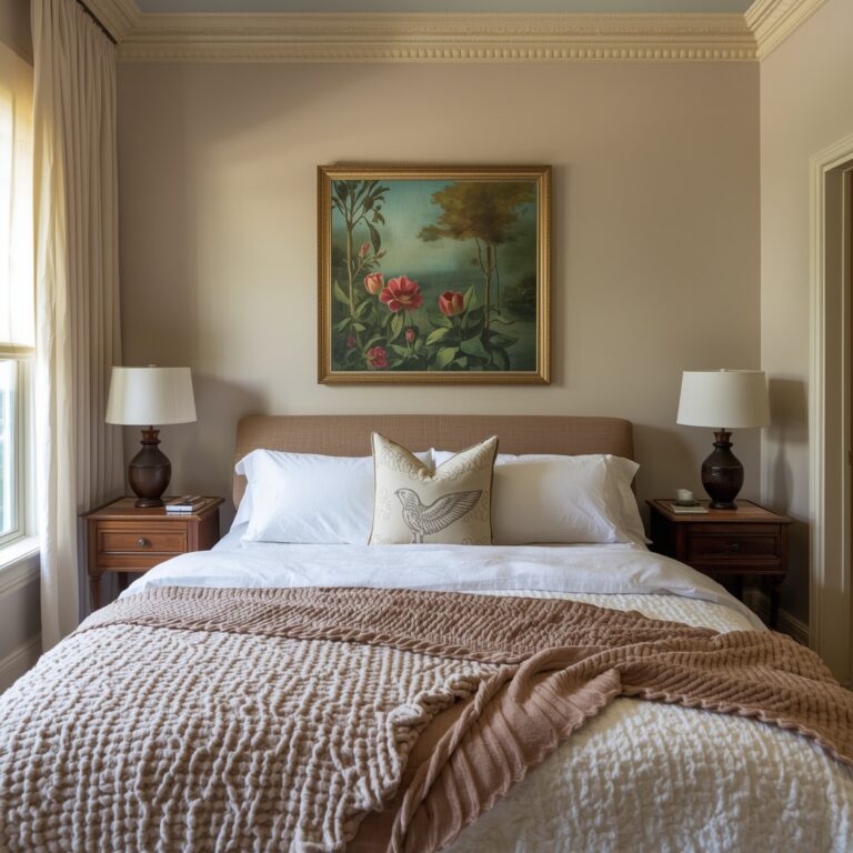
Warm Cream + Linen Beige: Like Living in a Cup of Coffee
When in doubt, start with the classics. Warm cream walls paired with linen beige decor turn any harsh light into a flattering glow.
When I painted mine (Benjamin Moore Simply White—not actually “simple” when you’re trying to choose from 73 shades of white), I noticed my morning light instantly went from wake up, sunshine to it’s okay, you can still be half asleep for a bit.
I paired it with:
Linen curtains from IKEA (washable—yes, I’ve tested that theory with a coffee spill)
A jute rug I scored for $40 at a flea market
Light oak frames for my art prints
Now, my sunroom feels like it’s always wearing a cozy sweater.

© 2025 AI Illustrator — Inspiration Only
IMAGE BY PINTEREST
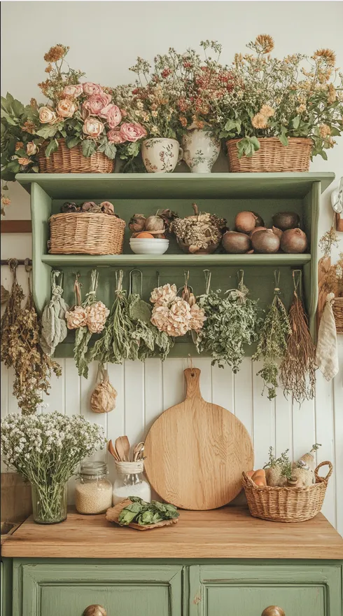
Misty Sage + Soft Gray: The Plant Lover’s Dream
If your sunroom is also home to half your plant collection (guilty), try misty sage walls with soft gray accents. It’s like sitting under a shady tree—but without the bugs.
I painted mine in Sherwin-Williams Silver Sage and my monstera looked so good against it, I almost apologized to it for not doing it sooner.
Pro tip: If your furniture has wooden legs, go for medium or light wood tones—dark woods can feel too heavy against soft green.
Bonus: It’s the kind of palette that still looks fresh when the sun shifts to afternoon.

© 2025 AI Illustrator — Inspiration Only
IMAGE BY PINTEREST
Pale Peach + Whitewashed Wood: Beach House Without the Sand
I used to think peach was only for retro bathrooms, but then I saw a pale peach sunroom in a friend’s place and it felt like stepping into warm sunlight.
The key is pale, not bright orange. Mine was Valspar Peach Blush, and I paired it with a whitewashed wood coffee table I snagged off Facebook Marketplace (shoutout to the seller who threw in two wicker baskets for free).
Morning light + peach = cinematic breakfast vibes.
Sky Blue + Warm Sand: For the Coastal-at-Heart
I’ll admit, I was nervous about blue because sometimes it can feel… cold. But sky blue with warm sand-colored accents? That’s pure “beach morning before the tourists arrive.”
Here’s what I did:
Sky blue walls (Blue Heaven by Behr)
Sand-toned throw pillows from H&M Home
Bamboo blinds to filter the sun
The light feels fresh without making you feel like you’re in a fridge.
Buttercream Yellow + White: Happiness in Wall Form
Yellow can be tricky—you don’t want “highlighter,” you want “soft breakfast sunshine.” Buttercream yellow walls with white trim hit the sweet spot.
I used Behr Sunbeam, painted the window frames white, and added a vintage white café table I found at a thrift store. Now, my east-facing sunroom basically is my morning coffee mood board.
Blush Pink + Brass: Unexpectedly Grown-Up
Blush pink gets a bad rap for feeling too “teen bedroom,” but a muted dusty blush paired with brass accents is seriously chic.
When I helped my friend redo her sunroom in this palette, we used:
Blush walls (Mellow Coral by Sherwin-Williams)
Brass curtain rods from Target
Sheer ivory curtains from West Elm
The morning light turned the blush into the kind of glow that makes everyone look good.
Off-White + Natural Wood: Scandinavian Calm
If you’re a “less is more” person, off-white walls with natural wood furniture make the morning light feel pure without being clinical.
I went with Farrow & Ball Pointing and paired it with a raw oak bench, a cream throw, and a couple of terracotta pots with trailing plants.
It’s basically the sunroom equivalent of a deep breath.
The Secret to Not Regretting Your Color Choice
Paint swatches are liars. They look perfect under store lighting, then at home in morning light they can suddenly scream, “Surprise! I’m neon!”
Here’s my foolproof test:
Get sample pots—yes, even if they’re $6 each.
Paint a big square on the actual wall (not just a tiny patch).
Look at it for a few days in the morning, midday, and evening.
Make sure it still plays nice with your furniture and flooring.
Trust me, the $20 you spend on samples is worth avoiding a $200 regret.
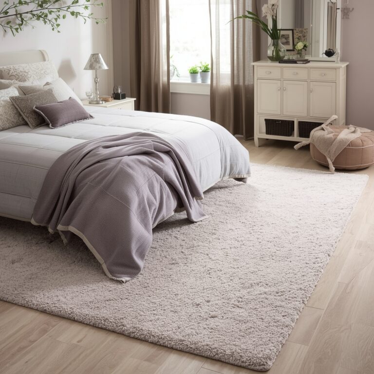
Fabric and Furniture: The Unsung Heroes
Even the perfect wall color can get sabotaged by the wrong fabrics.
Avoid:
Shiny curtains (instant glare factory)
Heavy, dark rugs that eat up light
Go for:
Sheer linen or cotton blends for windows
Neutral rugs with texture—jute, wool, or flatweave
Light, breathable throws for a layered look
Why This Matters More Than You Think
Before I softened the colors in my sunroom, I barely used it in the morning. The light was just too harsh. I’d grab my coffee and go straight to my desk.
Now? I linger. I watch how the light moves across the rug. Sometimes I read. Sometimes I just sit there and scroll Pinterest while pretending I’m “gathering inspiration.”
The color palette changed the mood of the whole space—and, honestly, my mornings.
Final Sip Thoughts
Whether you’re into misty greens, buttery yellows, or chic blush tones, the right sunroom color palette makes your morning light feel soft, inviting, and just a little magical.
And here’s my final tip? Test it in your actual morning routine. Pajamas on, coffee in hand, laundry basket in the corner. If you still love the color then—it’s the right one.