Best Paint Colors for North Facing Rooms (No More Dull Walls)
Advertisement

Paint Colors for North Facing Rooms: Cozy Up Your Space
So, picture this: A few months ago, I stood in my living room, coffee in hand (that’s a constant in my life, folks), and stared at the walls. They were painting me into a corner—literally! My north-facing room was dark, dreary, and felt more like a cave than the cozy haven I envisioned. I knew I needed to do something about it, and as I tried to conquer the doom of daily chores, all I could think about was how bleak the space felt. I mean, who wants to hibernate under a blanket in a room that resembles a dungeon?
After wrestling with my weekdays and contemplating paint swatches as the weekend approached, I dove headfirst into the world of paint colors for low light. And let me tell you, I learned a ton about what brings warmth and life into spaces that get less sunlight.
© 2025 AI Illustrator — Inspiration Only
If you find yourself in a similar pickle—staring into the depths of gloom that is your north-facing room—keep reading! I promise I’ll share what worked for me and help you unveil the perfect warm paint colors that will brighten up your beloved space.
What You Should Know: Warm Paint for Low Light
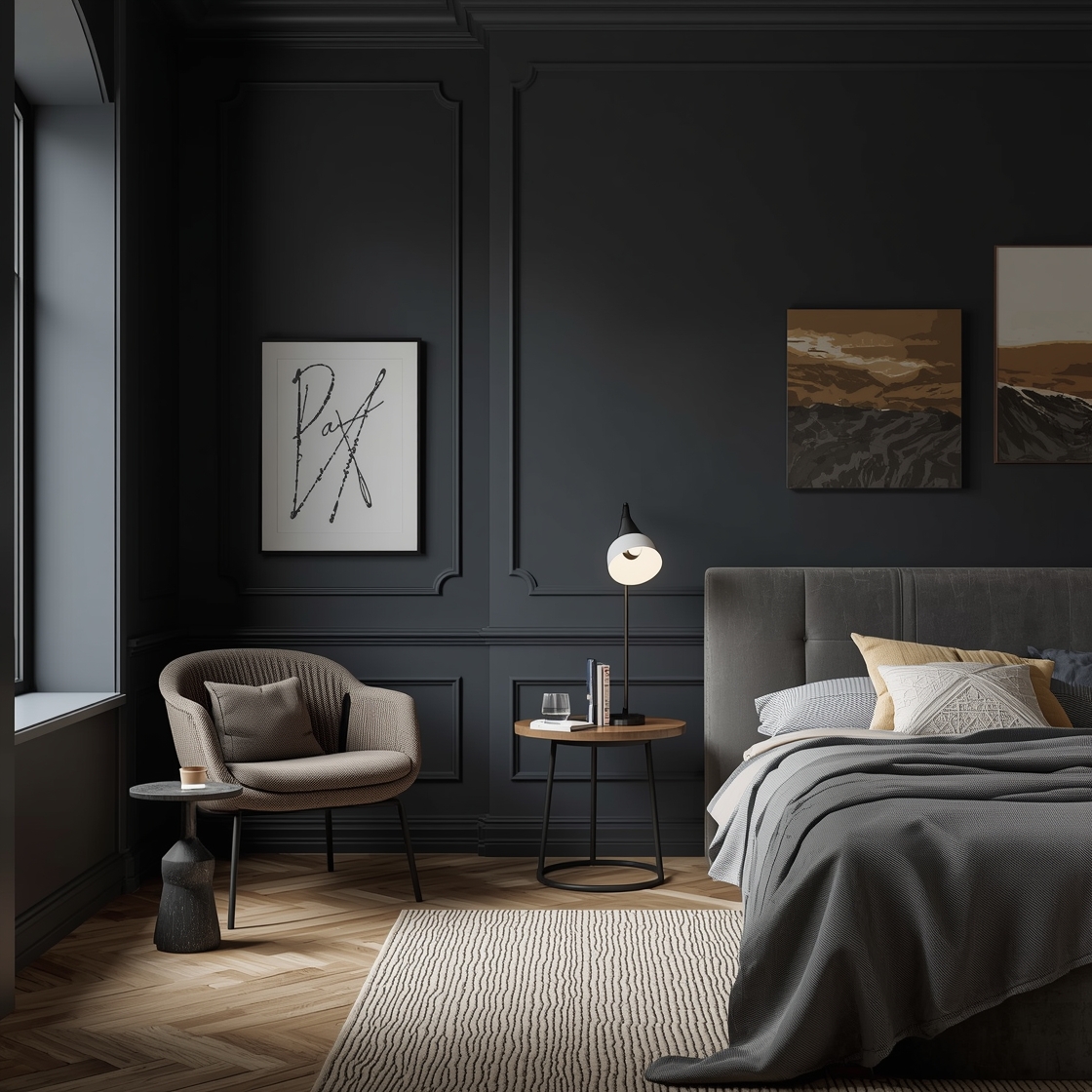
Before I launched myself into the wild world of brushes and rollers, I learned that north-facing rooms receive softer, cooler light throughout the day. That means, unless you want to live in a perpetual state of winter, you need to be strategic about your paint choices. A warm paint for low light can turn that moody space into a snug retreat.
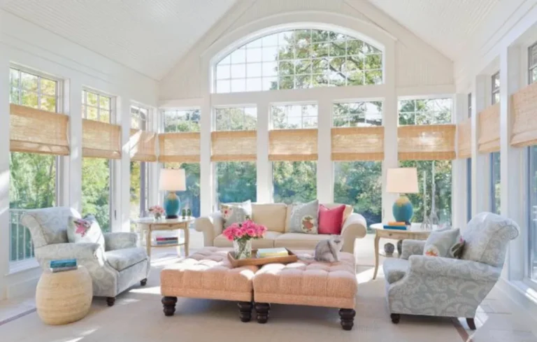
When you pick your paint, think warm neutrals—think beige, creamy whites, soft pastels. You want colors that will reflect light instead of absorbing it. If you’re in a rental, don’t worry—I’ve got your back! These suggestions are budget-friendly and renter-approved!
Follow our WhatsApp Channel for easy bedroom ideas, small-space tips, storage tricks, and budget decor fixes.
Follow on WhatsApp1. The Magic of Creamy Whites
Let’s start with the good ol’ reliable creamy whites. My initial instinct was to go bright, but boy, was I off the mark! I swatched my way through pure white and immediately noticed how stark it looked in my dim light. It felt like I was sitting in a dentist’s office, and we all know how much joy that brings! So I opted for a lovely, creamy white instead.
Why it worked:
- Warmth: It offers a cozy vibe and reflects light beautifully.
- Timelessness: Creamy whites never go out of style. They’re like your favorite pair of pajama pants—comfortable and wonderfully reliable.
After a roller-coaster ride of emotions (and maybe a small skirmish with the paint tray), I was thrilled to find how much airiness this color created.
© 2025 AI Illustrator — Inspiration Only

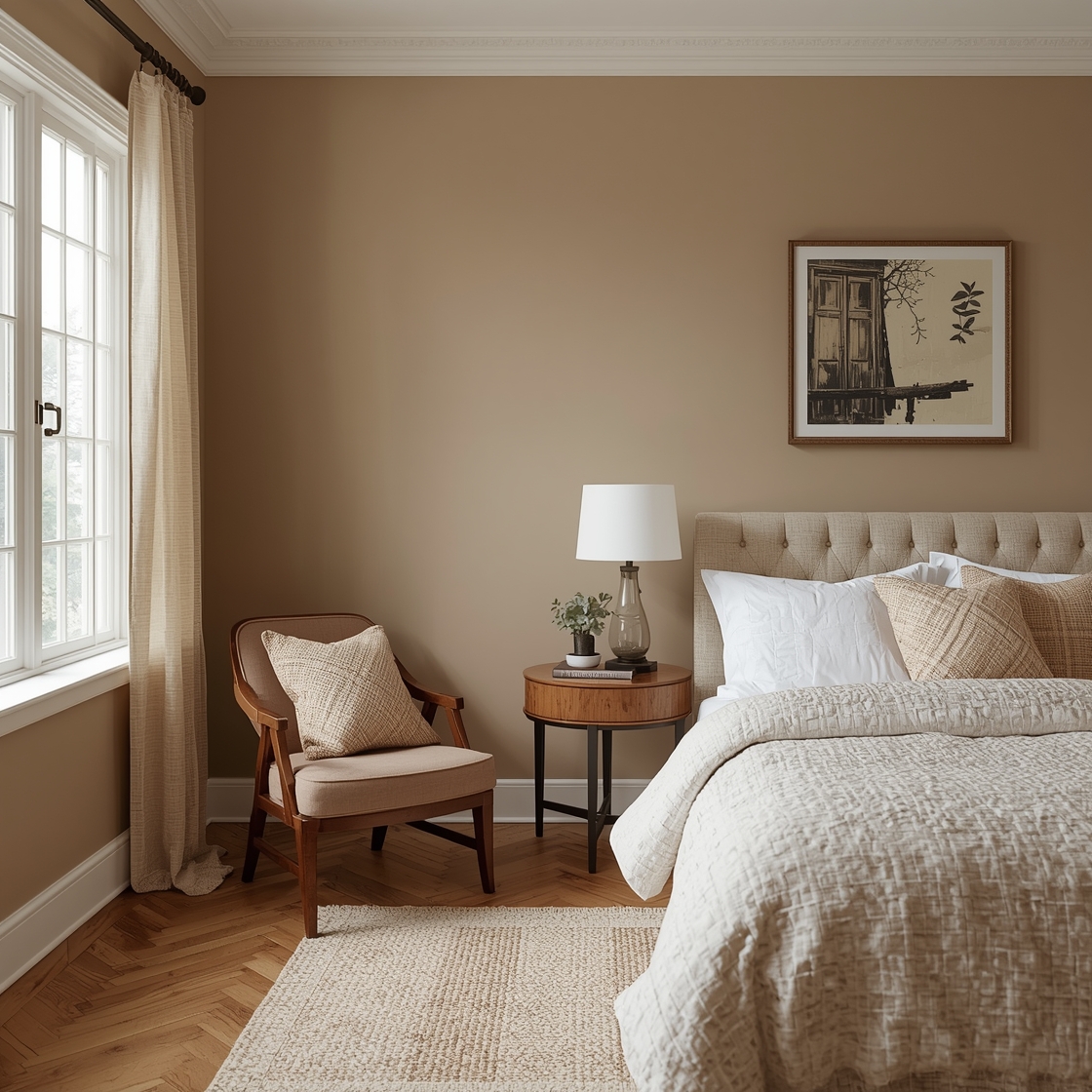
2. Soft Beige – The Unsung Hero
When I explored the world of soft beiges, it was like my home finally sighed in relief. Seriously, you wouldn’t believe how dramatic a soft beige can be! It’s like giving your room a lovely warm hug every time you walk in.
Imagine sipping your morning coffee bathed in delicious warm light.
What I learned:
- Versatility: Soft beige pairs beautifully with almost every color scheme. You can change your décor accessories as often as you change your mood (hello, comfy cushion covers!).
- Optical Illusion: It can make a small space feel more expansive without feeling cold.
The result? My north-facing room transformed into a cozy nook that whispered “stay a while.” Perfect for knitting marathons or binging shows guilt-free!
3. Dusty Pastels – A Little Whimsy
Oh, the pastel brigade! If you’re worried about being too drab, consider adding a touch of dusty pastels. I thought pastels would lean too sweet for my personal style, but a dusty peach ended up being the perfect compromise.
How to play it right:
- Use them sparingly on accent walls or in smaller areas to balance out the space.
- Combine with white trims or furniture for a fresh approach that doesn’t overwhelm.
Dusty pastels brought a burst of joy on those rainy days when I might otherwise felt like I was hibernating.
© 2025 AI Illustrator — Inspiration Only
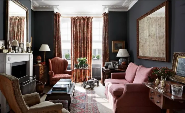
4. Warm Grays: Keeping It Neutral
Oh, how I struggled here, friends! I initially picked what I thought was a warm gray, but I ended up with an almost-blue wall that made me feel like I’d called an art store and ordered too much “marine.”
Learn from my folly!
Choose warm grays: They can give an elegant finish without being too intense. It will feel inviting yet sophisticated.
Want a well-balanced look? Pair warm gray with wooden accents for a rustic touch that feels charming and timeless.
Mistakes I Almost Made (or Actually Made)
Hey, I’m here to share the good, the bad, and the downright awkward. As I obliterated my walls with hopeful paint strokes, I almost went full-on trendy with navy blue. Like, what was I thinking?!
What did I learn? Trends are great, but you have to think about what matches your space and your vibes.
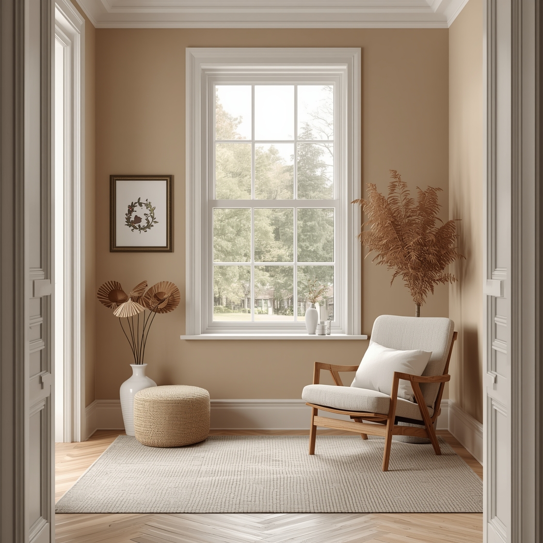
5. Greige: Best of Both Worlds
You heard me right! Greige—a perfect blend of gray and beige—should officially be added to the list. It’s like that mystical unicorn of paint colors. I ended up trying it on a whim, chasing my color dynamic dreams!
How greige works magic:
- Timelessness: It pairs beautifully with white trim and dark furnishings or even indigo sofas.
- Flexibility: Change your accents, and you’ve got a whole new ambiance!
I can’t tell you how many compliments I’ve received on this “unexpected” color choice. Plus, it feels both cozy and modern. What’s not to love?
© 2025 AI Illustrator — Inspiration Only
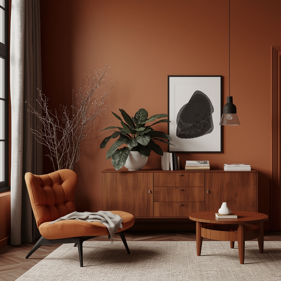
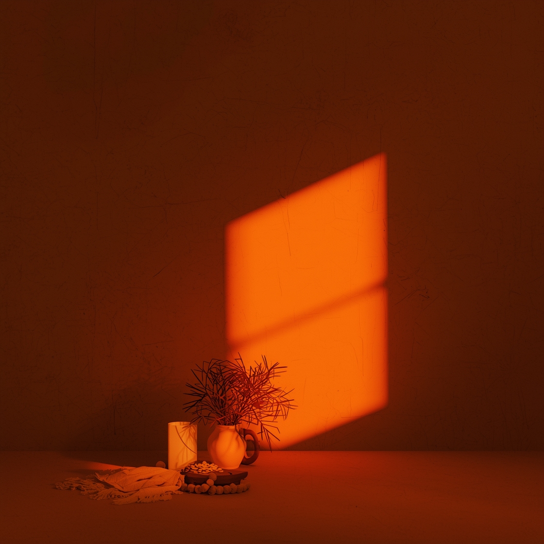
6. Earthy Tones: Taking the Scenic Route
Is it just me, or does anyone else find earthy tones irresistible? The first time I laid eyes on a terracotta orange against my north-facing wall, I could almost hear the paint sing! It’s warm and inviting—a burst of good vibes no matter the weather outside.
Blending earthy tones:
- Perfect for accent walls or even furniture. Think chairs, rugs, or dressers.
- They create a sense of coziness and comfort as they mimic the warmth of the outdoors.
I mean, who wouldn’t want that feeling?
© 2025 AI Illustrator — Inspiration Only
What I’d Do Differently If I Started Over
If I had a time machine (and a spare weekend), I’d definitely spend more time on swatches. I underestimated how different colors look in diverse light conditions.
Pro tip: Grab those test pots! Swatch on your walls, let them sit for a day, and watch what they do with the available light. It’ll save you from gray regret!
A Small Decision Moment
At some point, you might wonder whether your diligent paint selections are worth it.
- Cheap vs. Quality: Save money when possible, but know that quality paint will leave you with better coverage and longevity!
- Temporary vs. Permanent: If you’re in a rental, keep it renter-friendly for easy transitions.
Endless decisions can make you feel paralyzed; trust your gut.
Conclusion: Embrace Change, One Brushstroke at a Time
So there you have it! My little journey with warm paint for low light and how north-facing rooms don’t have to feel like dark caves. Embracing cozy colors transformed my space, and I hope these ideas spark something for you, too. Every small change counts, even if it’s just a fresh coat of paint!
If you’re still figuring out how to bring warmth into your home, remember: it’s all about experimenting with what feels right for you.
You might also like these cozy tips on creating a warm space or check out my musings on small apartment living—they’re all part of the journey to feel at home.
© 2025 AI Illustrator — Inspiration Only