
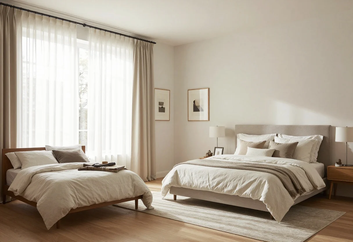
15 Bedroom Mistakes That Make Your Room Look Cheap — and How to Fix Them Fast

11. Pillows That Flop (Or Too Many Of Them)
© 2025 AI Illustrator — Inspiration Only
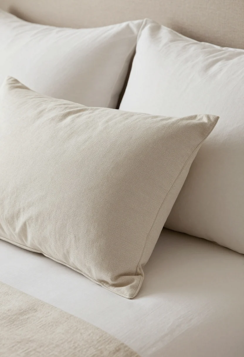
Sad, slouchy pillows and mountains of throw pillows both cheapen the bed. The bed is the star; give it some structure.
Fix It:
- Refresh inserts: Use down or down-alternative for bounce. Size up inserts (e.g., 20″ insert for 18″ cover) for a plump look.
- Edit your stack: 2–4 sleeping pillows + 2 euros (for queen) or 3 (for king) + 1–2 accent pillows.
- Steam or karate chop (yes, really) for crisp edges and a tailored vibe.
Quick Bedroom Check
Is Your Bedroom Making Your Room Look Cheap?
Answer these quick questions to see which bedroom mistakes may be making your space feel messy, small, or unfinished.
10. Bed-In-A-Bag Vibes
© 2025 AI Illustrator — Inspiration Only
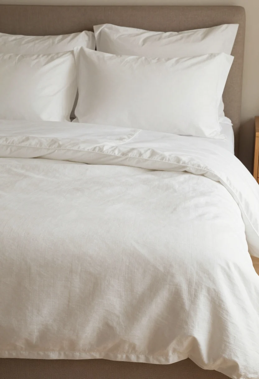
Shiny microfiber comforters and hyper-coordinated sets look inexpensive—even if they weren’t. Texture beats sheen every time.
Fix It:
- Go natural: Cotton percale, cotton sateen, or linen for duvet and sheets.
- Layer thoughtfully: Duvet + lightweight quilt/coverlet folded at the foot = hotel finish.
- Solid or subtle: Choose solids or small-scale patterns. Avoid overly glossy or busy prints.
9. Cluttered Nightstands And Visible Cords
© 2025 AI Illustrator — Inspiration Only
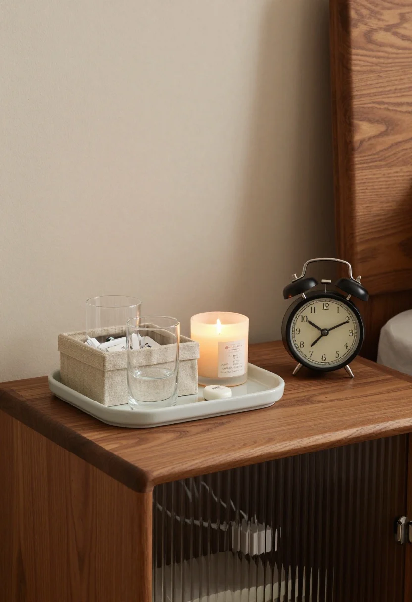
Visual noise cheapens everything. Chargers, water bottles, five half-burned candles, and lotion bottles aren’t “decor.”
Fix It:
- Contain it: Use a tray to corral essentials and a lidded box for the not-cute stuff.
- Hide cords: Cord clips, cable sleeves, or a nightstand with cord cutouts make a big difference.
- Upgrade your alarm: A pretty clock or a speaker-alarm feels elevated and functional.
Related Home Decor Guide
Is Your Bathroom Making Your Home Look Cheap?
These small bathroom mistakes can make your home feel outdated, cluttered, or less expensive — but the fixes are simple.
See Small Bathroom Mistakes →8. Art That’s Too Small (Or Hung Too High)
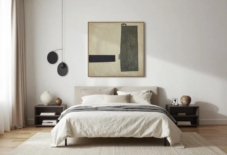
Teeny art over a king bed looks like a stamp on a billboard. And art hung near the ceiling? That’s a no.
Fix It:
- Scale it up: Over a queen/king bed, aim for art that’s 50–75% the bed’s width.
- Hang low: The bottom of the piece should be 6–10 inches above the headboard.
- Gallery grids: If using multiple pieces, keep consistent spacing (2–3 inches) and cohesive frames.
7. Ignoring Texture (Everything Smooth And Shiny)
© 2025 AI Illustrator — Inspiration Only
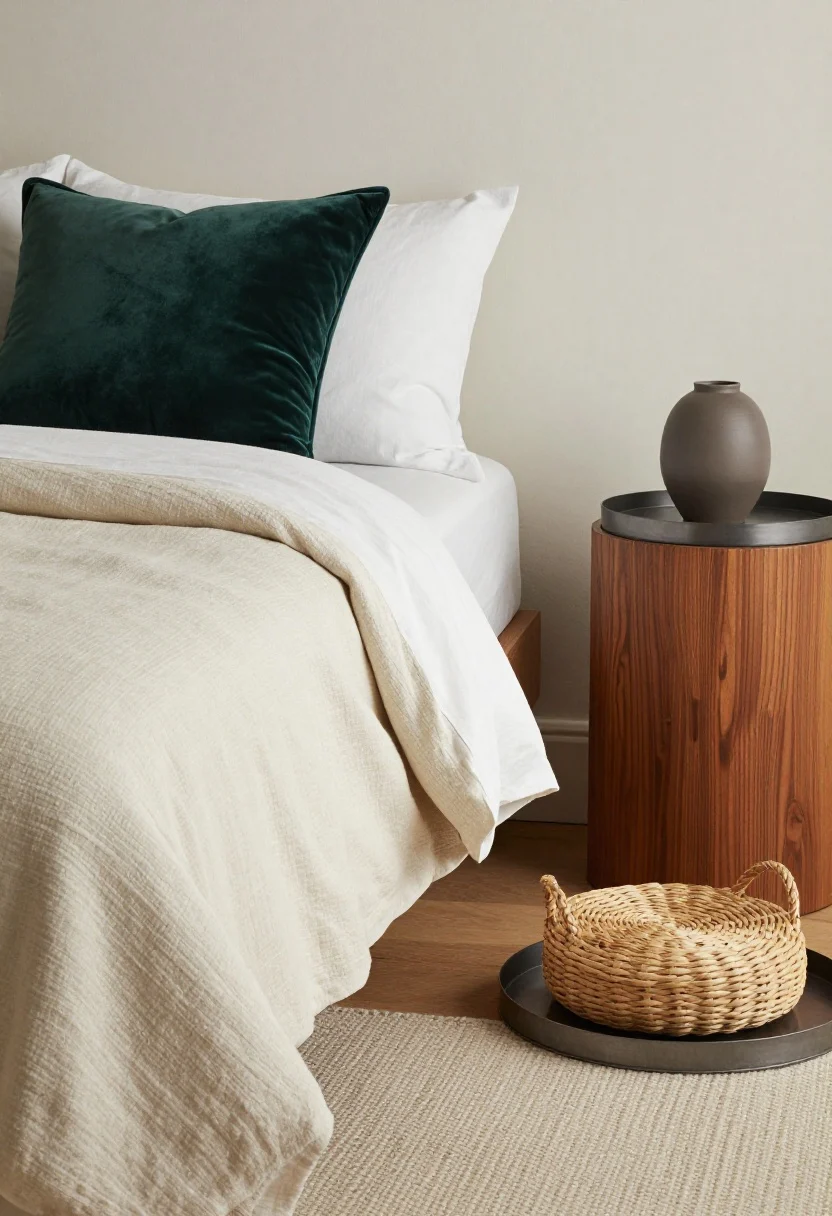
Shiny + smooth everywhere feels budget and flat. The quickest upgrade is layering textures so light and shadow do the heavy lifting.
Fix It:
- Mix materials: Linen duvet, velvet pillow, nubby throw, woven basket, matte ceramic lamp.
- Contrast is king: Pair warm wood with cool metal, soft fabric with structured shapes.
- Rule of three: Aim for at least three distinct textures in each vignette (bed, dresser top, reading nook).
6. All The Same Wood Tone
© 2025 AI Illustrator — Inspiration Only
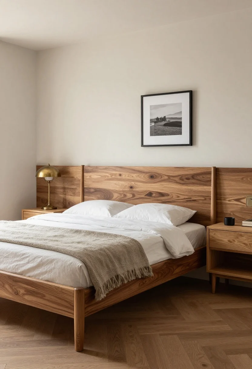
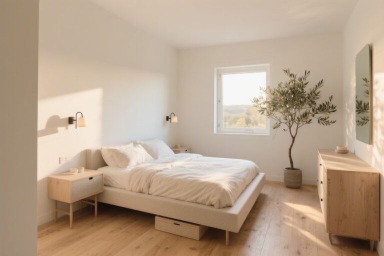
Bedroom furniture in a single identical finish can look like a budget bundle. Real homes mix and match; that’s what gives depth.
Fix It:
- Choose a hero wood (e.g., walnut bed), then add contrast with a lighter/brighter tone for nightstands or dresser.
- Unify with undertones: Warm with warm, cool with cool. Avoid one red-orange piece next to greenish oak.
- Sprinkle metal: Black iron or aged brass breaks up wood-on-wood and adds polish.

One Comment
Comments are closed.