9 Decorating Mistakes That Are Making Your Home Look Cheap (and How to Fix Them)

You know that feeling when a room looks “off,” but you can’t quite point to why? It’s usually a handful of tiny choices adding up to one big “meh.” The good news: most “cheap-looking” decor mistakes are super fixable—often in a weekend and without melting your credit card. Let’s get your place looking polished, intentional, and a lot more expensive (without actually being expensive).
1. Skimpy Rugs Shrink Your Room
© 2025 AI Illustrator — Inspiration Only
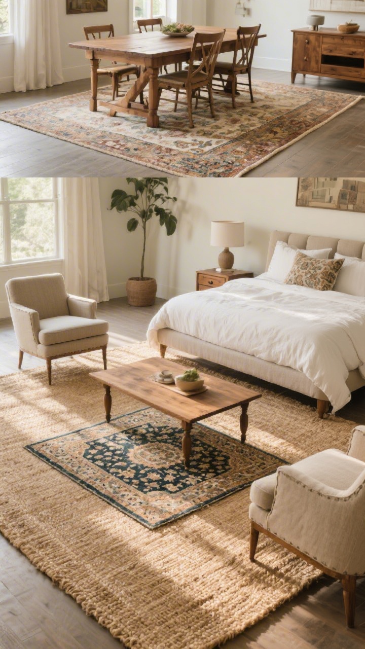
A too-small rug is the decor equivalent of capri pants in winter: confusing and uncomfortable. When rugs float like lonely islands, the whole room feels disjointed and—yep—cheap.
Fix It: Size Up and Anchor
- Living room: Front legs of your sofa and chairs should sit on the rug. Aim for 8×10 minimum in most spaces; larger rooms may need 9×12.
- Dining room: The rug should extend 24 inches beyond the table on all sides so chairs don’t fall off the edge when pulled out.
- Bedroom: At least the bottom two-thirds of the bed (and nightstands if you can swing it) on the rug. A 5×7 rarely works under a queen—go 8×10 if possible.
- Budget tip: Layer a smaller vintage or patterned rug over an affordable woven jute or sisal to get the scale right.
2. Matchy-Matchy Furniture Sets Feel Flat
© 2025 AI Illustrator — Inspiration Only
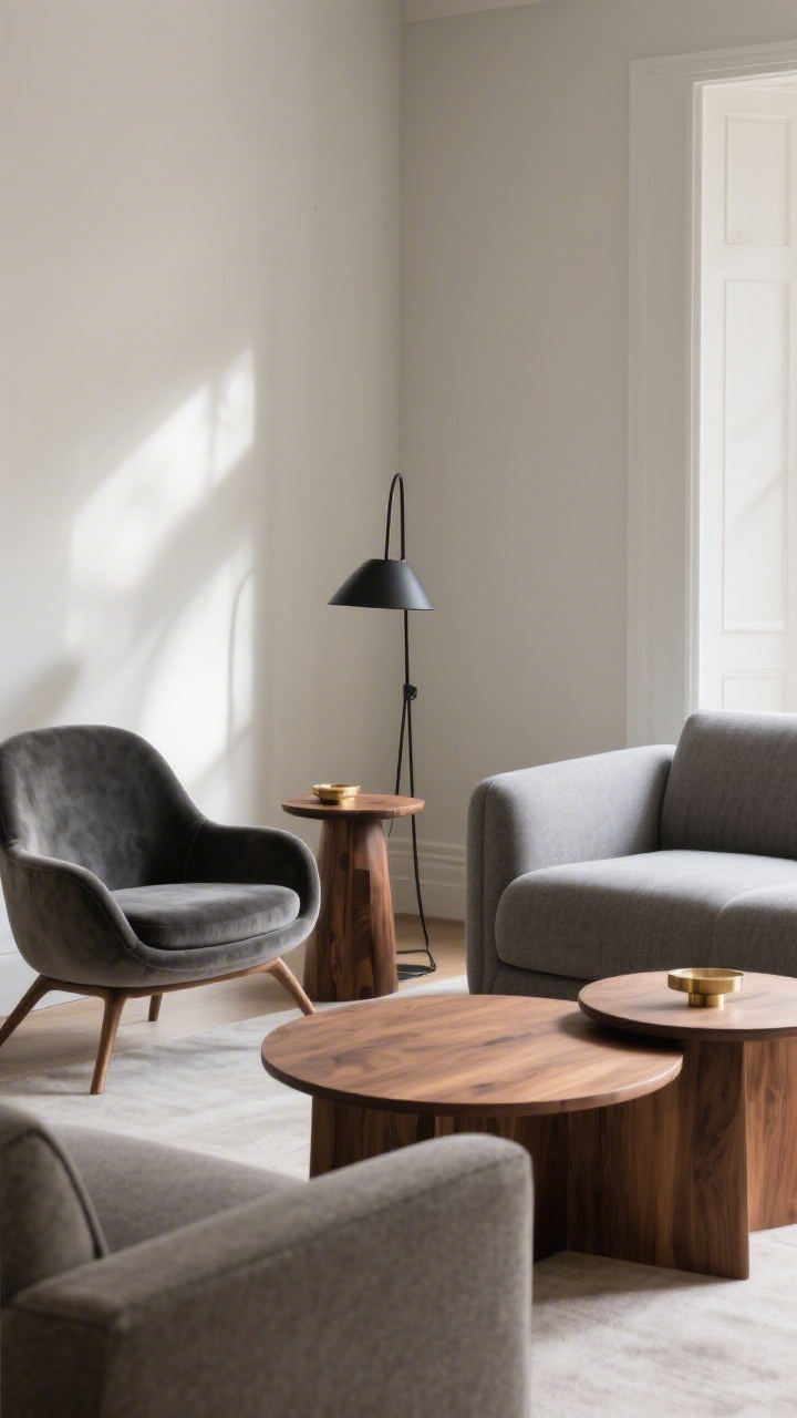
Buying the whole living room “set” seems easy—until your place looks like a furniture showroom. Too much matching reads cookie-cutter, not curated.
Fix It: Mix, Don’t Match
- Vary materials: Pair a fabric sofa with a wood side table and a metal floor lamp.
- Change silhouettes: If your sofa is boxy, try a round coffee table or curved chairs for contrast.
- Swap one big piece: Keep your sofa, but replace the matching loveseat with two accent chairs. Instant upgrade.
- Color cohesion: Use a tight color palette across different pieces so it feels intentional, not random.
3. Bad Lighting = Cheap Vibes
© 2025 AI Illustrator — Inspiration Only
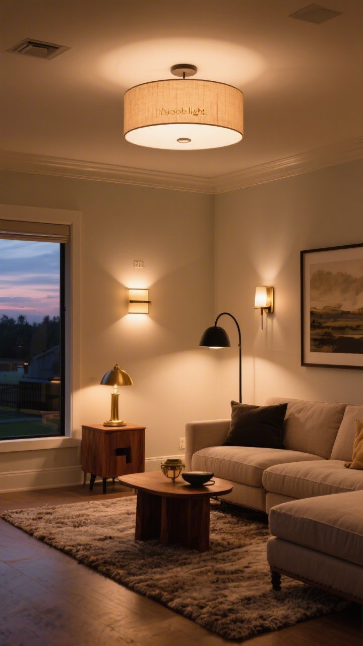
Overhead “builder basic” lights are brutal. One harsh light flattens everything—textures look dull, art looks sad, and skin tones? Not cute.
Fix It: Layer Your Light
- Three layers: Ambient (overhead), task (table/floor lamps), and accent (sconces or picture lights).
- Dimmer switches: They’re inexpensive and instantly make rooms feel luxe. FYI, warm bulbs (2700K–3000K) are your friend.
- Upgrade fixtures: Swap builder-grade boob lights for a semi-flush drum or a statement pendant. It’s like jewelry for your ceiling.
- Balance the room: Aim for at least 3–5 light sources in a living room. Yes, really.
4. Art Hung Too High (Or Way Too Small)
© 2025 AI Illustrator — Inspiration Only
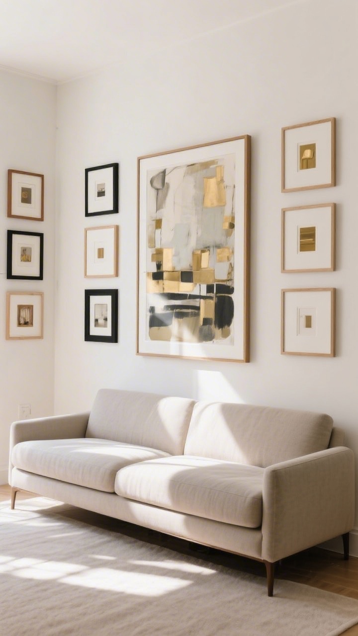
Tiny art on a big wall is like a postage stamp on a billboard. And when it’s hung near the ceiling? Your neck—and your style—both suffer.
Fix It: Scale and Placement Matter
- Eye level rule: Center art about 57–60 inches from the floor. Grouped art should read as one unit.
- Over the sofa: Art should be roughly two-thirds the sofa width and hang 6–8 inches above it.
- Go bigger than you think: If one piece feels too pricey, create a grid with affordable frames or a gallery wall with consistent spacing (2–3 inches).
- Mix frames: Black, wood, brass—variety adds richness. Keep mats consistent for cohesion.
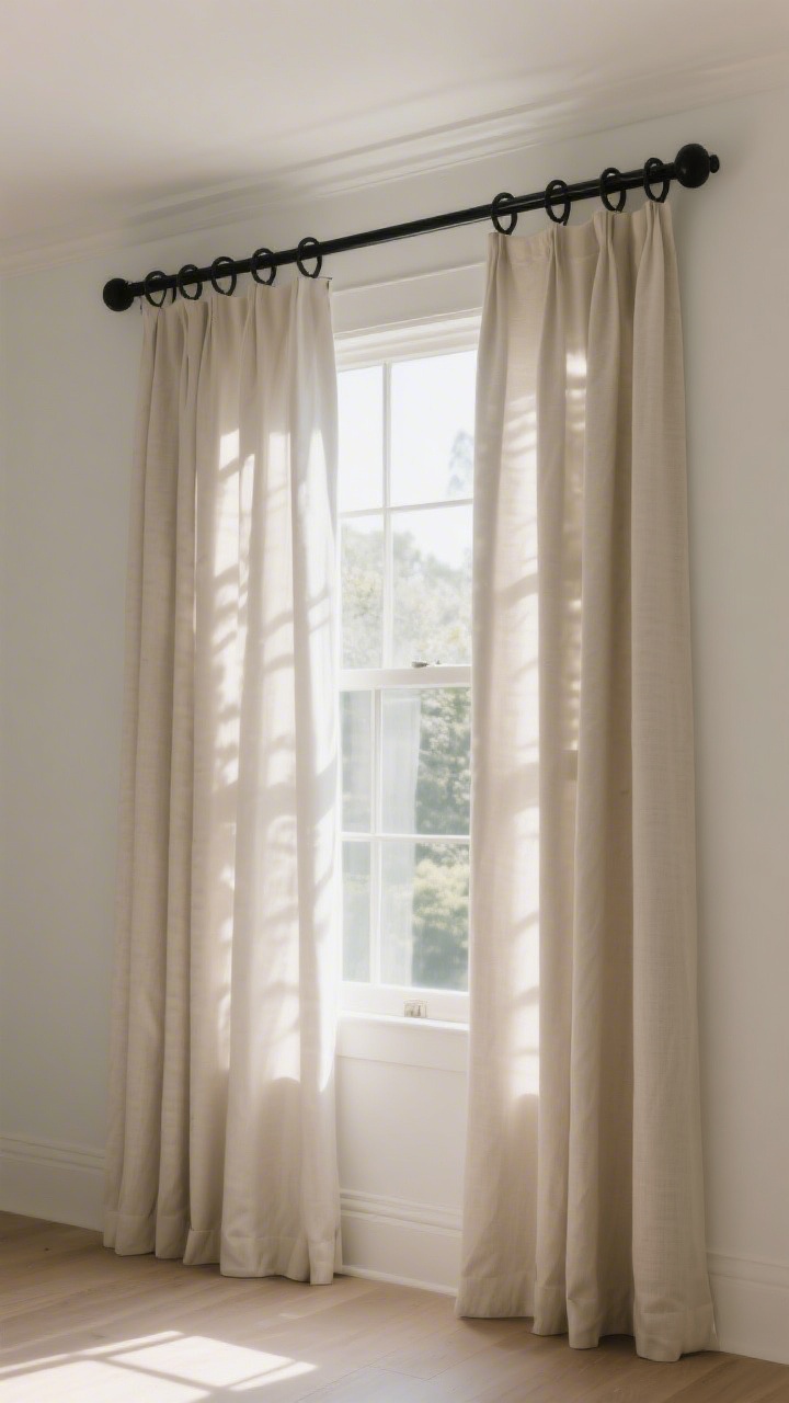
5. Curtains That Don’t Touch the Floor
© 2025 AI Illustrator — Inspiration Only
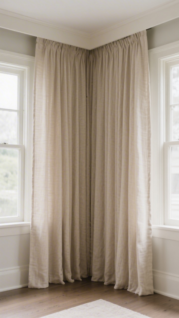
Short curtains are high-water pants for windows. They chop the room visually and make ceilings feel lower and the whole space, well, cheaper.
Fix It: Hang High and Wide
- Mount high: Install rods 4–8 inches above the window trim (or just below the ceiling) to elongate the wall.
- Go wide: Extend rods 8–12 inches beyond each side so curtains frame the window, not block light.
- Right length: Curtains should “kiss” the floor or have a slight break (0.5–1 inch). No ankle-length, please.
- Upgrade fabric: Linen or linen blends look elevated. If using budget panels, steam them and add clip rings for a tailored drape.
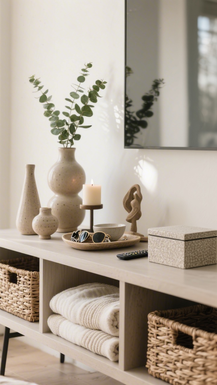
6. Cluttered Surfaces Kill the Mood
© 2025 AI Illustrator — Inspiration Only
Even beautiful decor looks cheap when every surface is crammed. Visual noise reads as chaos, not character.
Fix It: Curate and Contain
- Declutter ruthlessly: Keep only what you love or use. Donate the rest—your space will breathe.
- Style in odd numbers: Groups of three or five with varied heights feel balanced.
- Use trays and bowls: Corrals make everyday items look intentional. Keys + sunglasses + candle in a tray? Chic.
- Hide the mess: Baskets for blankets, closed boxes for remotes, lidded bins for kids’ stuff. Out of sight, upgraded vibe.
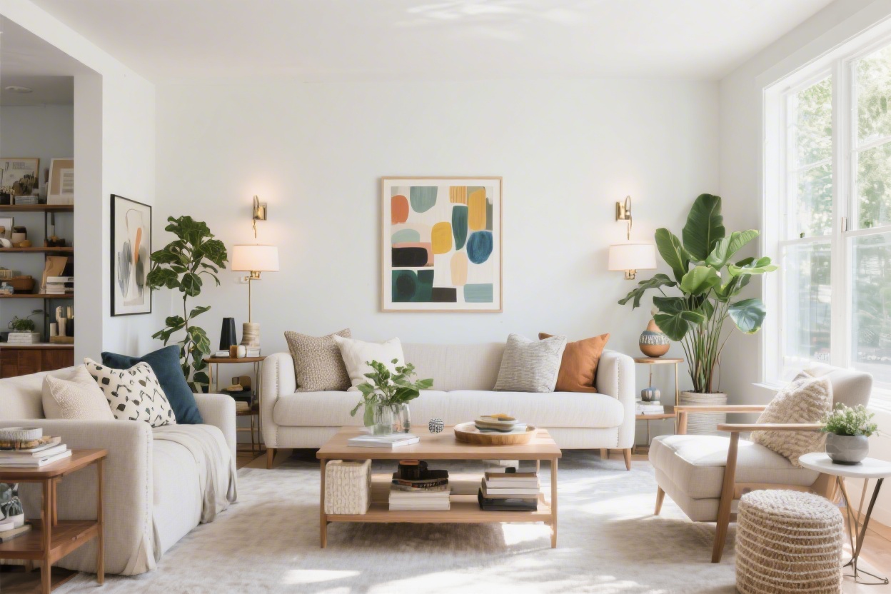
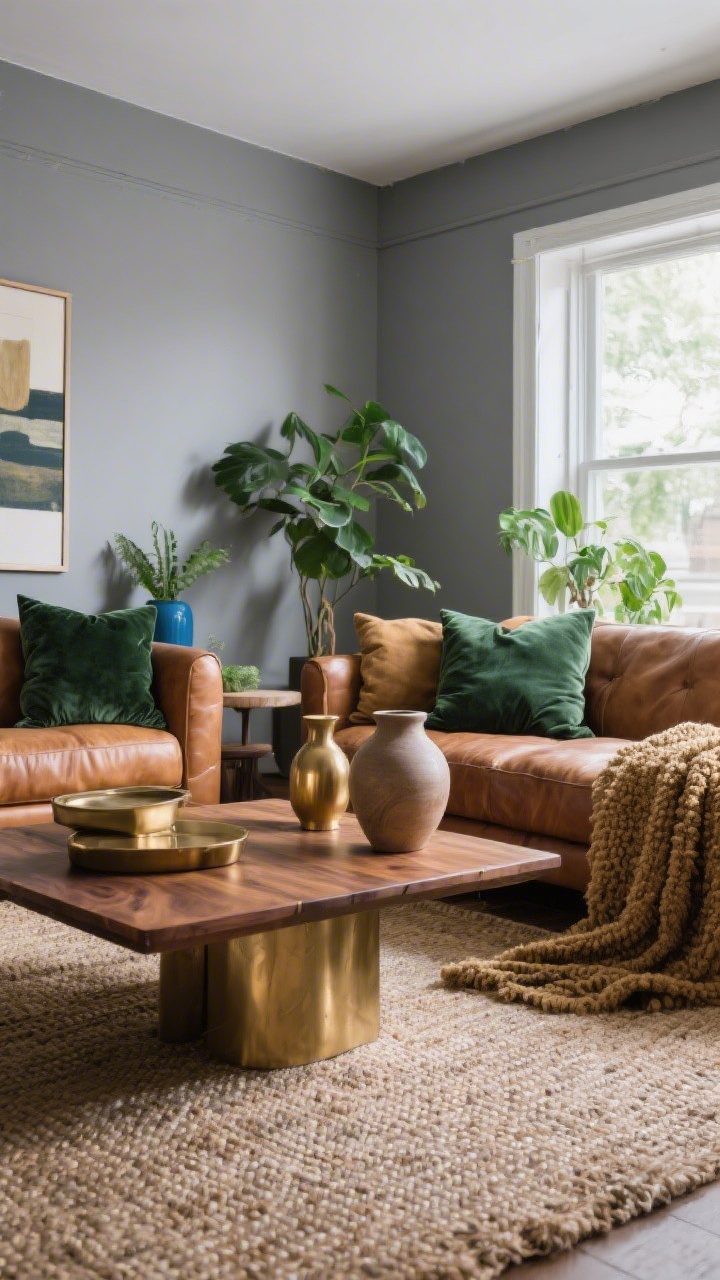
7. All Gray Everything (Or One-Note Color Schemes)
© 2025 AI Illustrator — Inspiration Only
Monochrome can be gorgeous, but the “everything gray” era left a lot of rooms feeling flat and lifeless. Too much of one tone = bargain basement energy.
Fix It: Layer Color and Texture
- Pick a palette: One main color, one supporting color, and 2–3 accent tones. Repeat them across the room.
- Add contrast: Pair cool tones with warm woods, leather, or brass to add depth.
- Texture = luxury: Think nubby boucle, smooth ceramics, raw wood, velvety pillows. Your eye needs variety.
- Plants count: A little greenery instantly adds life (and makes the space look cared for, IMO).
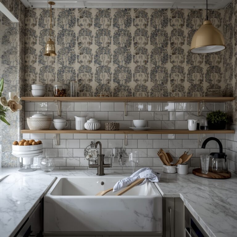
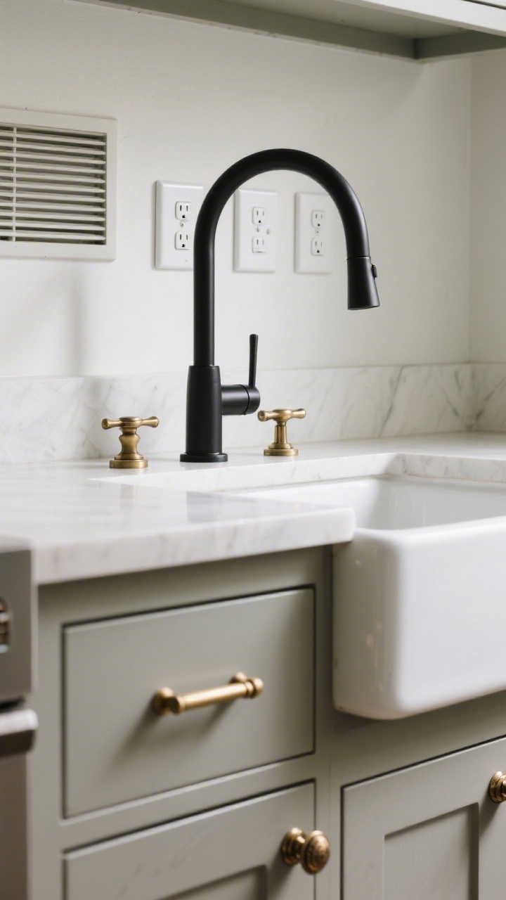
8. Cheap-Looking Hardware and Finishes
© 2025 AI Illustrator — Inspiration Only
Plastic-y knobs, builder faucets, and flimsy switch plates quietly cheapen your space. These little details are the handshake of your home.
Fix It: Swap the Small Stuff
- Cabinet hardware: Replace basic knobs with solid metal pulls in brass, bronze, or matte black. Mix knobs and pulls for interest.
- Faucets and fixtures: A single upgraded faucet can transform a bathroom. Look for simple, weighty designs.
- Switch plates and vents: Upgrade cracked or yellowed plates to clean white or metal. Paintable vent covers can disappear into the wall.
- Consistency is key: Keep finishes coordinated across rooms for a high-end feel (they don’t have to match perfectly, just harmonize).
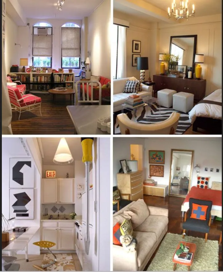
9. Blank Walls and Soulless Styling
© 2025 AI Illustrator — Inspiration Only
A home without personal touches reads like a rental staging—fine, but forgettable. If everything’s trendy and nothing’s “you,” it shows.
Fix It: Add Story and Soul
- Display what matters: Travel mementos, heirloom bowls, kids’ art in proper frames—mix them with decor pieces.
- Books = instant depth: Stack coffee table books, style shelves with spines in your palette, and mix in small sculptures.
- Layer textiles: Throws, pillows, and a bench cushion can make even basic furniture look bespoke.
- Create vignettes: Ground a grouping with a tray, add height (tall vase), add life (plant), add sparkle (candle). Done.
Bonus Mini-Fixes That Pay Off
- Paint touch-ups: Patch nail holes, freshen baseboards, and hit scuffs with a magic eraser. Clean = luxe.
- Door upgrades: Paint interior doors a moody color and add new levers—instant architectural interest, FYI.
- Scent strategy: A subtle, consistent home scent makes everything feel more polished. Keep it light.
Here’s the thing: making your home look expensive isn’t about price tags—it’s about intention. Scale your rugs, layer your lighting, hang your art right, and give your space some personality. Do a few of these this weekend, and you’ll be shocked at the before-and-after energy shift. Your home, but elevated—no lottery win required.