
9 Kitchen Cabinet Color Ideas That Transform Everything (and Your Sanity)
Advertisement

Ready to stop doom-scrolling paint chips and actually pick a cabinet color? Good. The right hue can change your kitchen’s mood, make it feel bigger, brighter, or wildly more chic—sometimes all three. Below are nine color ideas with real-world tips, mix-and-match strategies, and zero fluff. Let’s make your cabinets the main character.
1. Soft Greige That Warms Without Overwhelming
© 2025 AI Illustrator — Inspiration Only
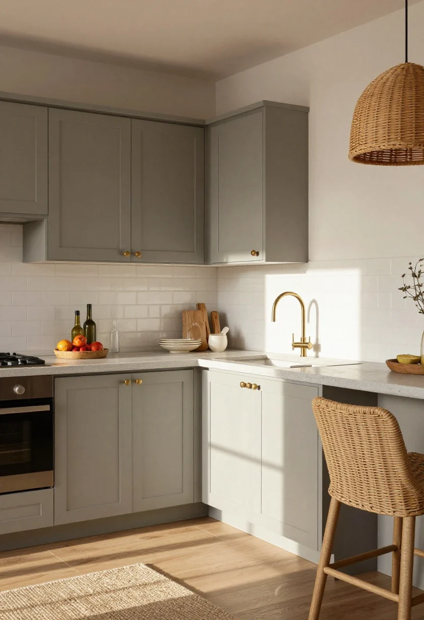
Greige (that easygoing blend of gray and beige) is the cabinet color that never ghosts you. It’s calm, cozy, and pairs with basically every metal, stone, and backsplash on earth. If you want a modern classic that won’t feel dated in two years, this is it.
Why it works
- Light-bouncing magic: Soft greige reflects light better than dark tones but has more depth than plain white.
- Pairs with anything: Wood floors? Check. Brass hardware? Check. Concrete counters? Also check.
Pro tips
- Choose a warm greige if you have cool lighting (north-facing windows) to avoid a chilly look.
- Layer in texture: rattan pendants, woven stools, or a wool runner to keep it cozy.
What to shop for: Sample pots, satin-finish cabinet paint, brushed brass pulls.
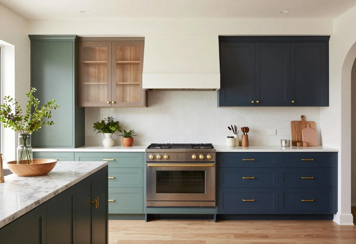
2. Moody Navy That Feels Luxe (Not Heavy)
© 2025 AI Illustrator — Inspiration Only
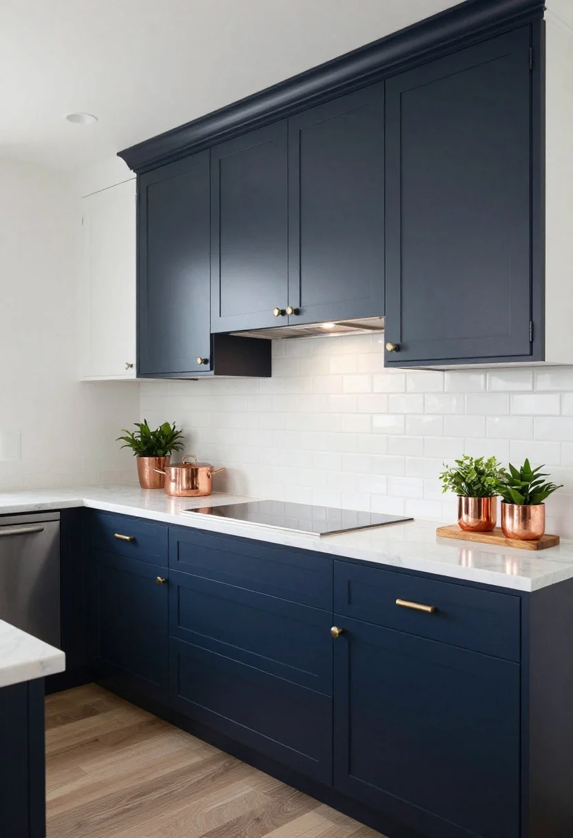
Deep navy is the kitchen equivalent of a tailored blazer—timeless with a little swagger. It grounds a space and makes even simple subway tile look curated. Bonus: it hides scuffs like a pro.
Why it works
- Visual drama: Instantly elevates flat-front cabinets and works with both marble and butcher block.
- Color-friendly: Plays nice with hits of color—think coral art, green plants, or copper pots.
Pro tips
- Use on lowers only and keep uppers white or pale for balance.
- Choose a matte or satin sheen for sophistication and fewer fingerprints.
What to shop for: Satin paint, polished nickel knobs, under-cabinet lights to brighten shadows.
Follow our WhatsApp Channel for easy bedroom ideas, small-space tips, storage tricks, and budget decor fixes.
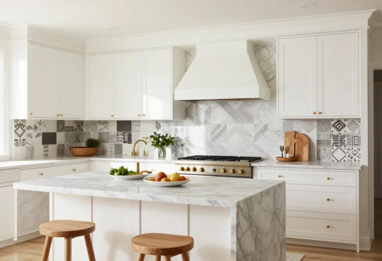
Follow on WhatsApp3. Creamy White That Isn’t Builder-Grade
Hear me out: white can be amazing—if it’s the right white. Go creamy, not stark, so your kitchen feels intentional and inviting instead of, well, dental-office chic.
Why it works
- Universally flattering: Soft white flatters stone veining, warm floors, and mixed metals.
- Instant brightness: Perfect for small kitchens and spaces with limited daylight.
Pro tips
- Test swatches in morning and evening light—whites can shift warm or cool dramatically.
- Add contrast with black hardware or a darker island so it doesn’t go bland.
What to shop for: Color cards, black bar pulls, soft-close hinges.
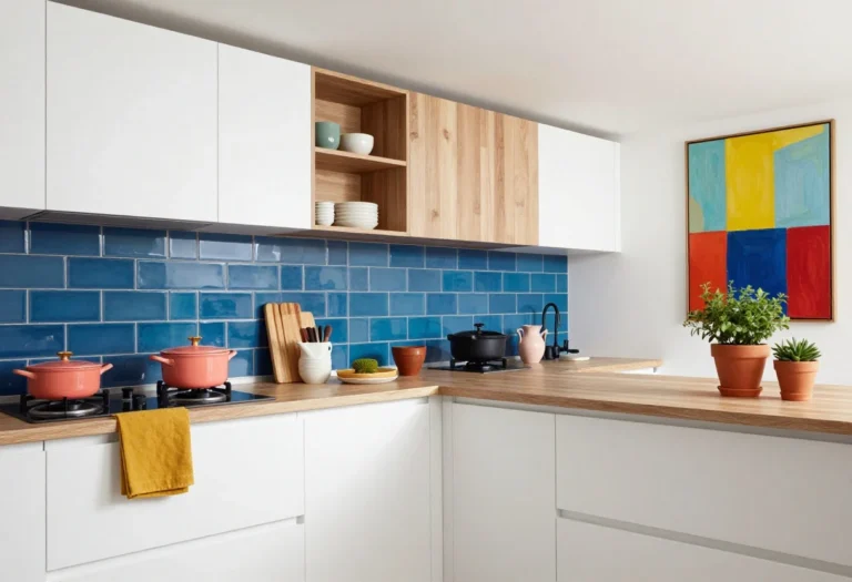
4. Earthy Green That Feels Like Fresh Herbs
© 2025 AI Illustrator — Inspiration Only
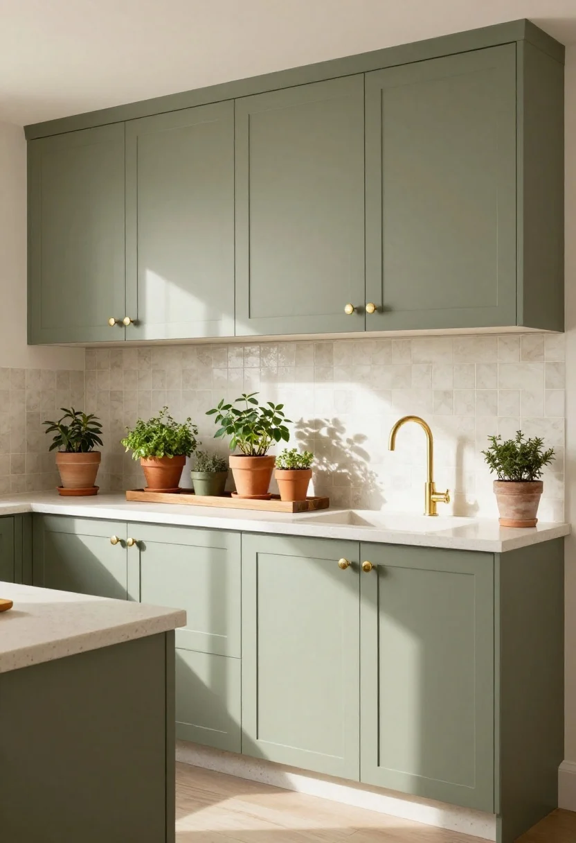
If you want your kitchen to feel grounded and alive, go green—literally. Earthy olive or sage reads organic, calm, and wildly on-trend without screaming “trend.” Think garden, but make it chic.
Why it works
- Nature-approved: Complements wood tones, terracotta, and natural stone.
- Versatile vibe: Can skew farmhouse, Scandinavian, or modern depending on hardware and lighting.
Pro tips
- Pair olive or sage with warm brass and off-white walls for a layered look.
- Keep the room balanced with light counters or a pale backsplash.
What to shop for: Brass knobs, linen cafe curtains, clay planters for a mini herb station.
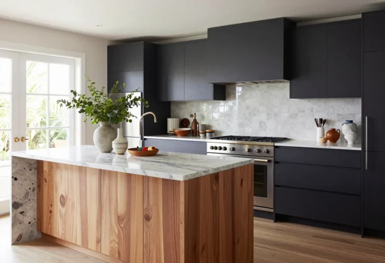
5. Charcoal Black That’s Surprisingly Livable
© 2025 AI Illustrator — Inspiration Only
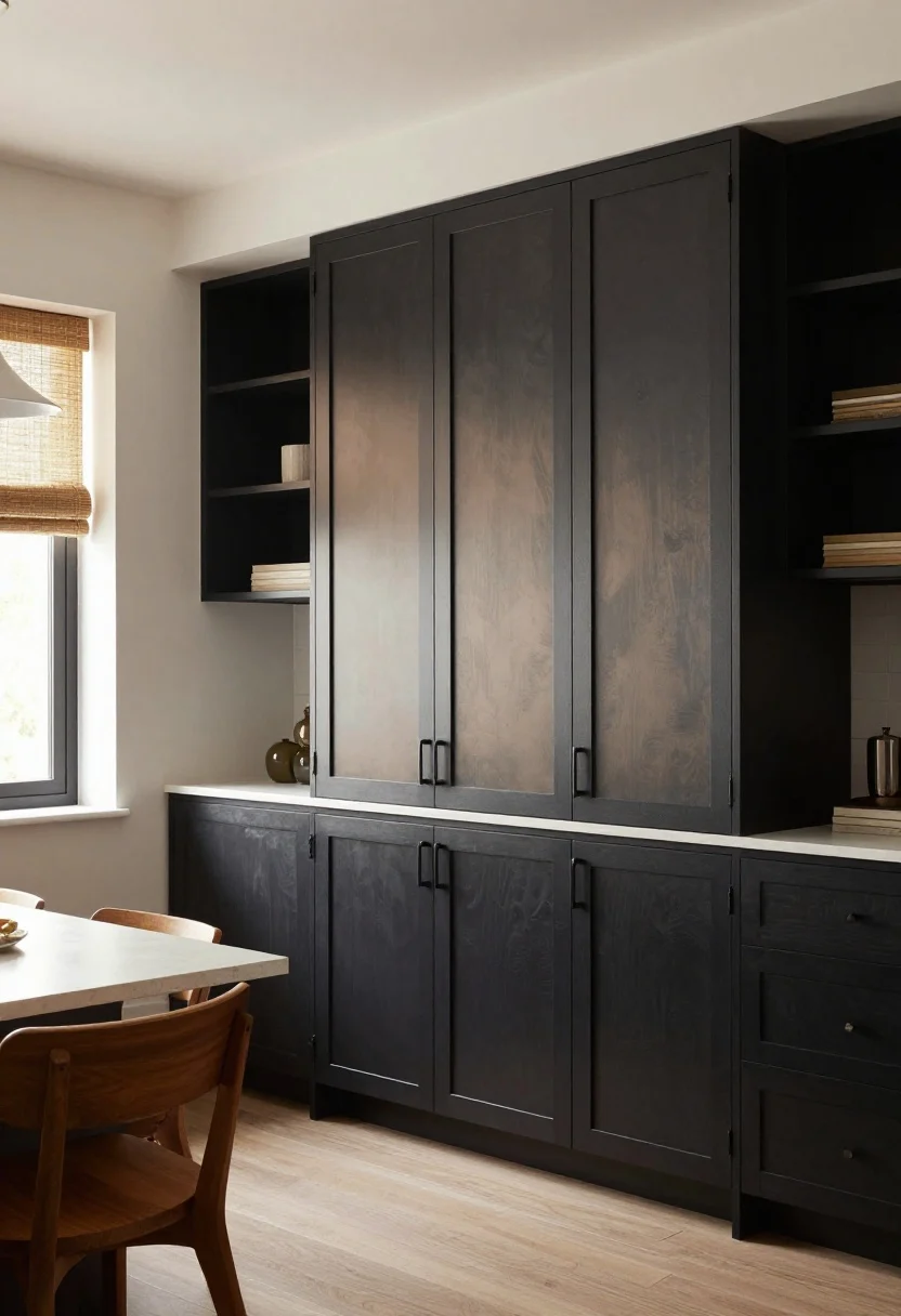
Black cabinets? Yes. They’re sleek, dramatic, and instantly elevate even a rental-grade kitchen. The secret is undertone—charcoal with a hint of warm taupe looks richer and friendlier than jet black.
Why it works
- Instant contrast: Makes white walls and light counters pop, like a gallery frame.
- Texture booster: Looks luxe on shaker doors and flat slab fronts alike.
Pro tips
- Use soft sheen (not glossy) to hide smudges and keep it sophisticated.
- Layer in warmth with wood stools, woven shades, and ambient lighting.
6. Dusty Blue That Calms Chaos
© 2025 AI Illustrator — Inspiration Only
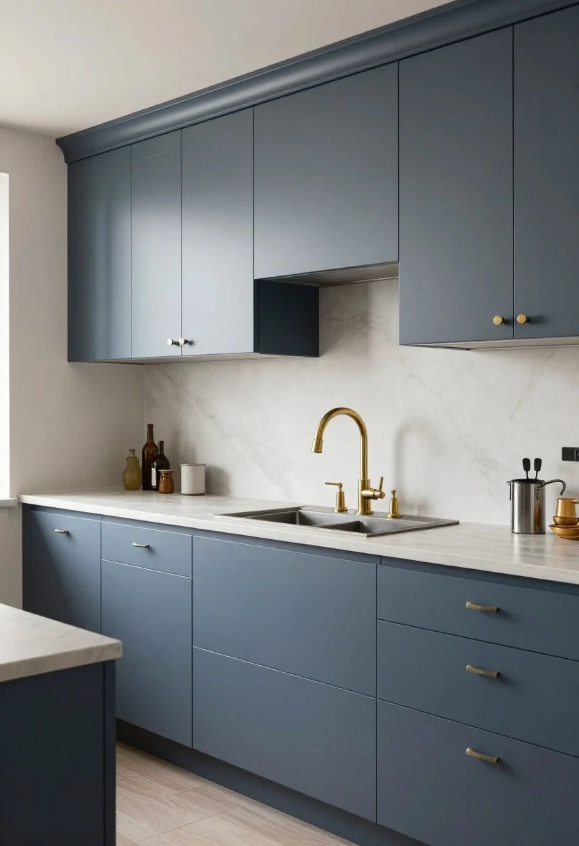
Dusty, grayed-out blue is the color equivalent of a deep breath. It cools visual noise (hello, fridge magnets) and pairs with warm metals for the perfect high-low mix. IMO, it’s a small-kitchen MVP.
Why it works
- Light but not flimsy: Adds color without overwhelming tiny spaces.
- Tone-matching champ: Works with warm brass, chrome, and matte black.
Pro tips
- Pick a blue with a touch of gray to prevent nursery vibes.
- Keep counters light and simple so the color stays the star.
What to shop for: Sample boards, long cabinet pulls, open-shelf brackets.
7. Two-Tone Magic: Light Uppers, Dark Lowers
© 2025 AI Illustrator — Inspiration Only
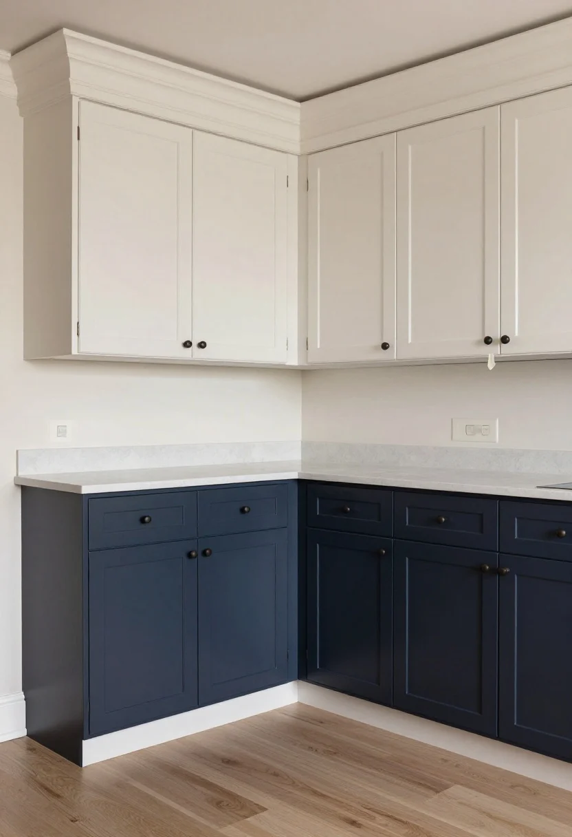
When you can’t commit to one color, pick two. Light uppers keep things airy, dark lowers anchor the room, and together they fake the look of custom cabinetry. It’s balance with benefits.
Why it works
- Visual height: Light uppers draw the eye up and make ceilings feel taller.
- Function-forward: Darker lowers hide wear in high-traffic areas.
Pro tips
- Repeat the darker color on the island for cohesion.
- Unify with matching hardware and one consistent countertop material.
What to shop for: Painter’s tape, primer, matching hinges, touch-up pens.
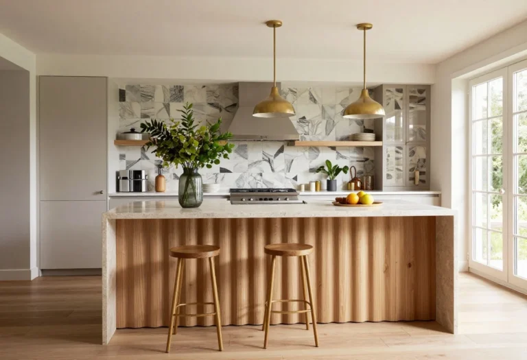
8. Warm Taupe With Euro-Chic Vibes
© 2025 AI Illustrator — Inspiration Only
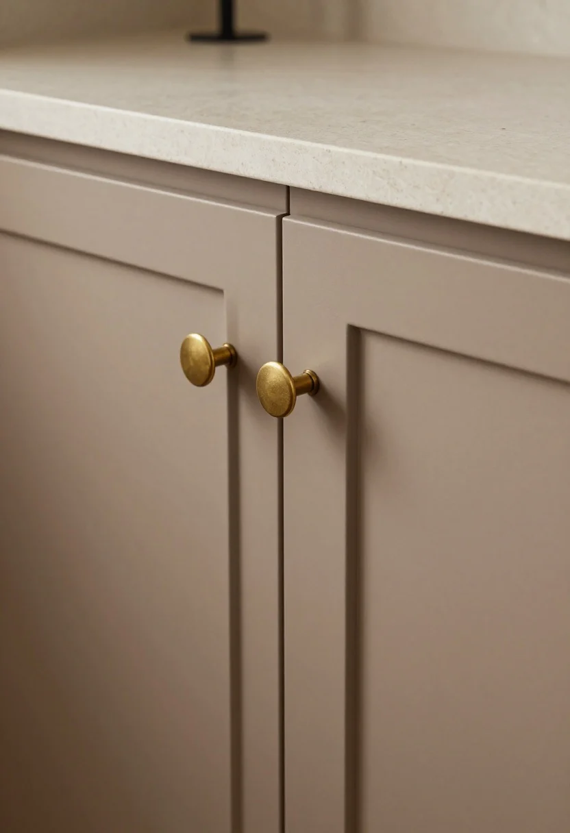
Warm taupe cabinets look straight out of a boutique hotel kitchen. They’re earthy and elevated, especially with fluted details or slab doors. It’s the “quiet luxury” of cabinet colors—subtle, but wow.
Why it works
- Elevated neutral: Warmer and richer than beige, more interesting than gray.
- Stone-friendly: Pairs gorgeously with travertine, soapstone, and honed marble.
Pro tips
- Choose a honed or leathered countertop to echo the softness of the paint.
- Try mixed metals—brass knobs, black sconces—for dimension.
What to shop for: Honed-look sealer, slim edge pulls, linen dish towels.
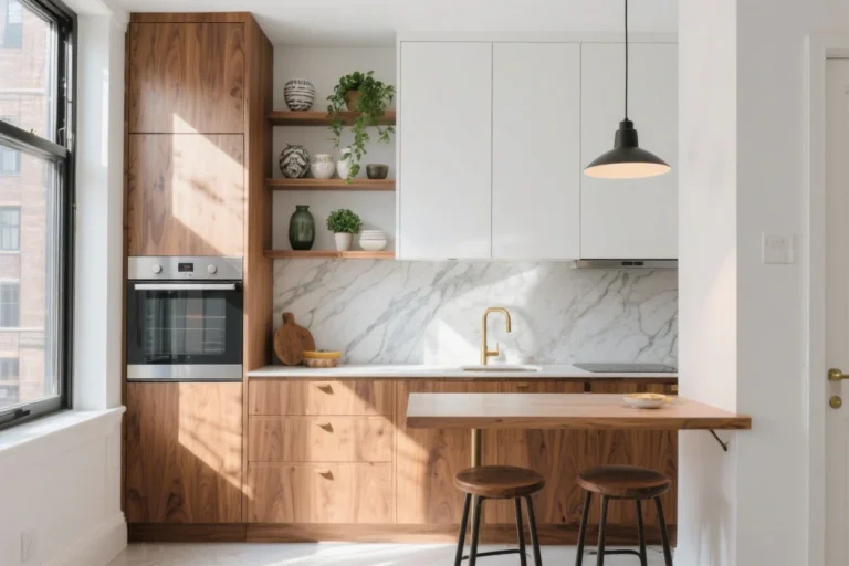
9. High-Contrast White And Wood
© 2025 AI Illustrator — Inspiration Only
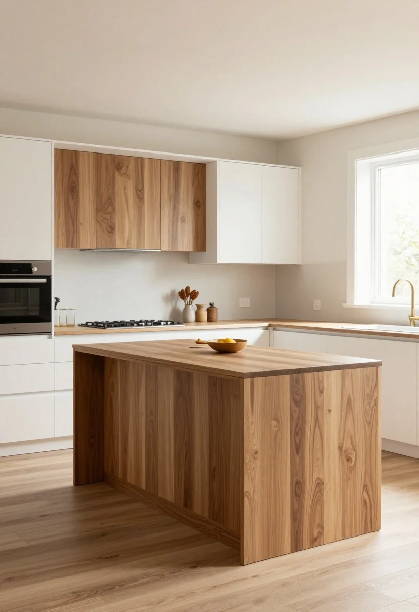
Not ready to paint everything? Mix painted white cabinets with warm wood (like oak or walnut). The combo feels fresh, layered, and looks custom without the budget meltdown.
Why it works
- Texture + tone: Wood grain adds movement; white keeps it bright.
- Flexible style: Skews modern, Japandi, or mid-century depending on lighting and hardware.
Pro tips
- Keep wood to the island or uppers and paint the rest for balance.
- Match wood tones to your floor undertone so things don’t clash.
What to shop for: Wood stain, clear matte topcoat, minimalist pulls.
Finish And Sheen Cheat Sheet
- Matte: Moody and modern, best for darker colors, hides texture, shows grease more.
- Satin/Eggshell: Sweet spot for cabinets—wipes clean, soft glow.
- Semi-Gloss: Durable and wipeable, but can highlight imperfections.
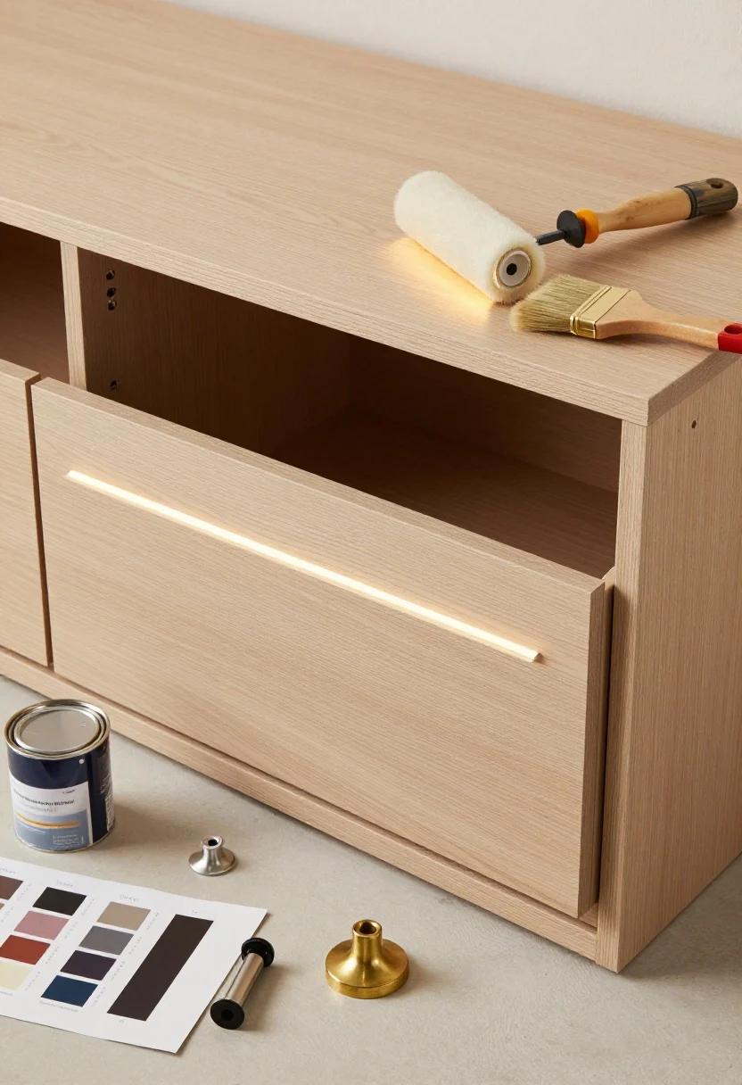
Prep Like A Pro (So Your Paint Lasts)
- Degloss + clean: TSP substitute and a light sand. Don’t skip.
- Prime: Use stain-blocking primer, especially over oak or dark colors.
- Thin coats: Two to three light coats beat one thick one, every time.
- Cure time: Let hardware wait 48–72 hours before heavy use. FYI, patience saves touch-ups.
Hardware Pairings That Rarely Miss
- Navy + Polished Nickel: Nautical, tailored, forever.
- Greige + Brass: Warm, soft, quietly glam.
- Black + Aged Brass: Dramatic, cozy, editorial.
- Sage + Matte Black: Fresh, modern, grounded.
Lighting Matters (A Lot)
- 2700–3000K bulbs for warm, flattering color rendering.
- Under-cabinet LEDs to reduce shadows on darker lowers.
- Glass or metal pendants to echo your hardware finish and tie the palette together.
Quick styling wins: Add a vintage rug, a bowl of citrus for color pop, and a wood cutting board to soften all the lines. Tiny changes, big energy.
What To Shop For (General)
- Cabinet paint and primer
- Rollers and high-density foam brushes
- Hardware: knobs, pulls, hinges
- Under-cabinet lighting strips
- Rugs and runners
- Open-shelf brackets and organizers
FAQ
© 2025 AI Illustrator — Inspiration Only
Q: Do I need special paint for cabinets?
A: Yes. Look for cabinet-grade or enamel paint with a durable finish (satin or semi-gloss). It levels better and stands up to cleaning.
Q: Should I spray or roll?
A: Spraying gives a factory finish, but rolling with a high-density foam roller is great for DIY. Thin coats and proper priming matter more than the method.
Q: How do I choose a color that won’t date fast?
A: Stick to nuanced neutrals (greige, taupe, creamy white) or classic deep tones (navy, charcoal). Test big swatches in your actual lighting before committing—daylight changes everything.
Final Take
Your cabinets are the biggest color surface in your kitchen—make them count. Whether you go moody navy, soft greige, or a bold two-tone moment, pick a hue that fits your light, your finishes, and your energy. You’ve got this—and your kitchen is about to look very “saved to favorites.”
Shop the Look on Amazon
Disclosure: As an Amazon Associate, this site may earn from qualifying purchases.
These product categories fit this article and give readers an easy next step when they are ready to shop.
- Painting Basics — Essential for durable, smooth cabinet color updates.
- Warm Hardware — Pairs with greige, taupe, and green palettes.
- Cool Hardware — Complements navy and creamy white schemes.
- Task Lighting — Brightens dark lowers and shows true color.
- Soft Styling — Adds warmth and contrast to painted cabinets.
One Comment
Comments are closed.