
Kitchen Color Ideas That Pop (and Make Takeout Look Fancy)

Your kitchen is doing a lot—coffee lab, snack HQ, gossip corner. The right color can make it all feel brighter, bigger, and, yes, a little show-offy. If your cabinets are sighing in beige, let’s fix that with nine high-impact color ideas that are bold but totally livable. Think fresh, modern, and surprisingly easy to pull off.
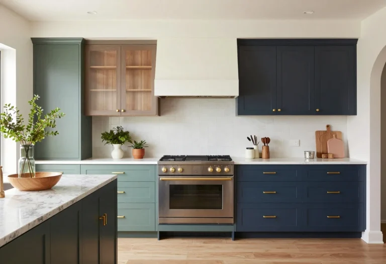
1. Saturated Navy With Warm Brass
© 2025 AI Illustrator — Inspiration Only
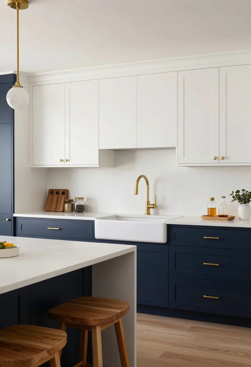
Meet the chic classic that never quits: deep navy cabinets. It reads timeless, hides fingerprints (bless), and instantly makes your kitchen look custom. Pair it with warm metals—brass, champagne gold, even unlacquered hardware—to keep it from feeling cold.
How to Pull It Off
- Use matte or satin navy on lowers, keep uppers white to open the space.
- Add brass pulls, sconces, and a bridge faucet for glow and contrast.
- Balance with warm wood stools or butcher block accents.
What to shop for: Brass cabinet hardware, navy-safe primer, warm wood stools, globe sconces.
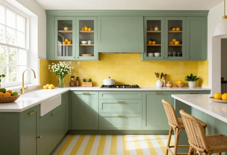
2. Sunny Marigold (But Make It Modern)
© 2025 AI Illustrator — Inspiration Only
Yellow kitchens are back, but keep it chic with marigold or mustard—not canary. It’s bright enough to energize mornings, but earthy enough to feel elevated. The trick is to mix in natural textures so it doesn’t scream school bus.
How to Pull It Off
- Paint a feature wall or pantry door marigold; keep cabinets light oak or white.
- Layer in rattan pendants, linen café curtains, and terra-cotta planters.
- Ground everything with a stone or concrete-look countertop.
Pro tip: Test swatches in daylight and at night—yellow shifts wildly, FYI.
What to shop for: Rattan lighting, linen textiles, ceramic planters, neutral rugs.
3. Forest Green + Creamy White
© 2025 AI Illustrator — Inspiration Only
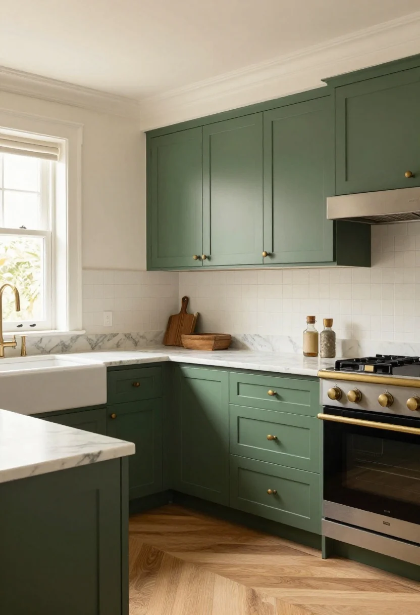
If you want cozy, luxe, and slightly cottagecore, go forest green with creamy white accents. It’s nature’s best duo—calm, rich, and endlessly photogenic. Bonus: it plays nice with both modern and traditional styles.
How to Pull It Off
- Paint lowers in rich green, keep uppers and walls a warm white.
- Introduce aged brass or black hardware—both look sharp against green.
- Add marble-veined quartz for an airy counter that pops against the depth.
What to shop for: Green paint samples, black cabinet pulls, veined quartz lookalikes, vintage-style rugs.
4. Black and White, But Graphic
© 2025 AI Illustrator — Inspiration Only
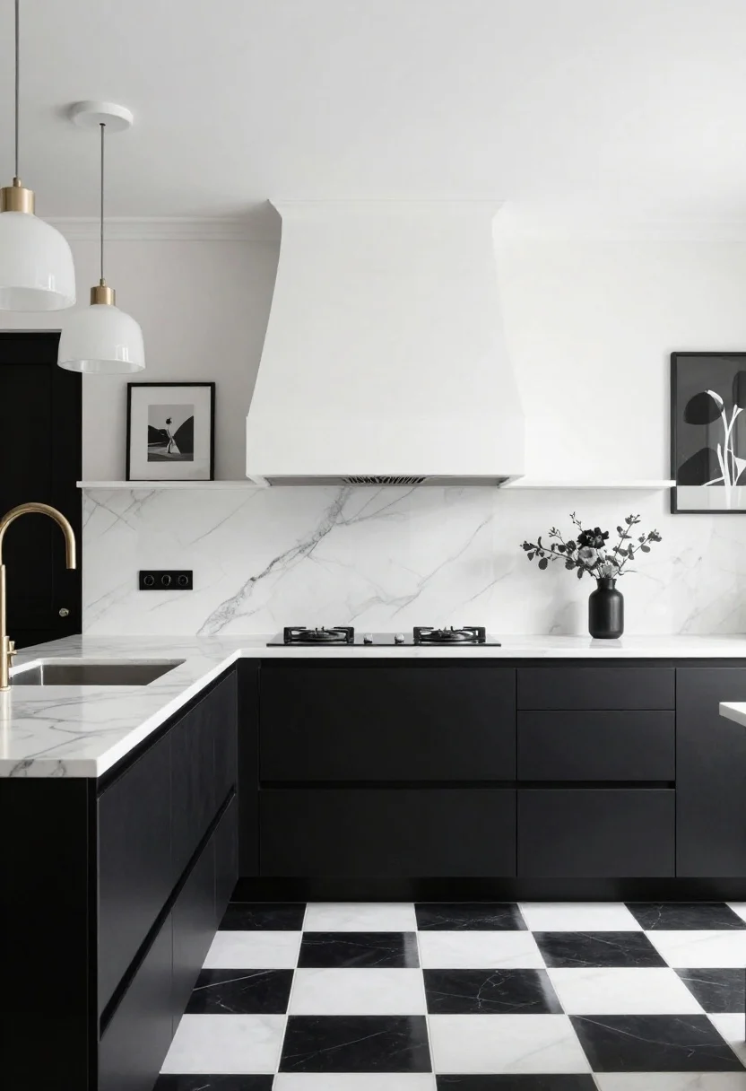
Black-and-white doesn’t have to be boring. Go high contrast with sharp lines, checker floors, and bold veining. The result: crisp, editorial, and wildly easy to accessorize season to season.
How to Pull It Off
- Choose matte black lowers with bright white uppers and a matching hood.
- Use a checkerboard floor (tile or vinyl) for instant drama.
- Bring in statement lighting to soften the edge—think milk-glass or fluted pendants.
Pro tip: Keep grout lines clean and thin for a tailored finish, IMO.
What to shop for: Checker tiles, milk-glass pendants, matte black pulls, framed black-and-white art.
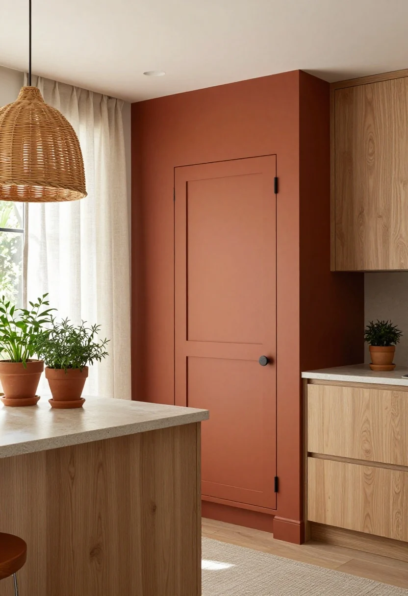
5. Terracotta and Blush Layers
© 2025 AI Illustrator — Inspiration Only
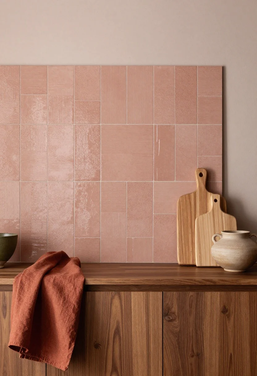
Want warmth without loudness? Try terracotta and blush. It’s sun-washed, Mediterranean-adjacent, and makes everything look intentionally curated—even your cereal boxes.
How to Pull It Off
- Paint walls a dusty blush; add a terracotta zellige backsplash or tile niche.
- Use walnut or oak cabinets for grounded warmth.
- Pop in olive or rust textiles for layered color without chaos.
What to shop for: Zellige tiles, wooden cutting boards, linen runners, earthy pottery.
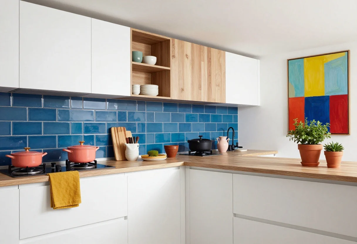
6. Electric Blue Accents (Strategic, Not Scream-y)
© 2025 AI Illustrator — Inspiration Only
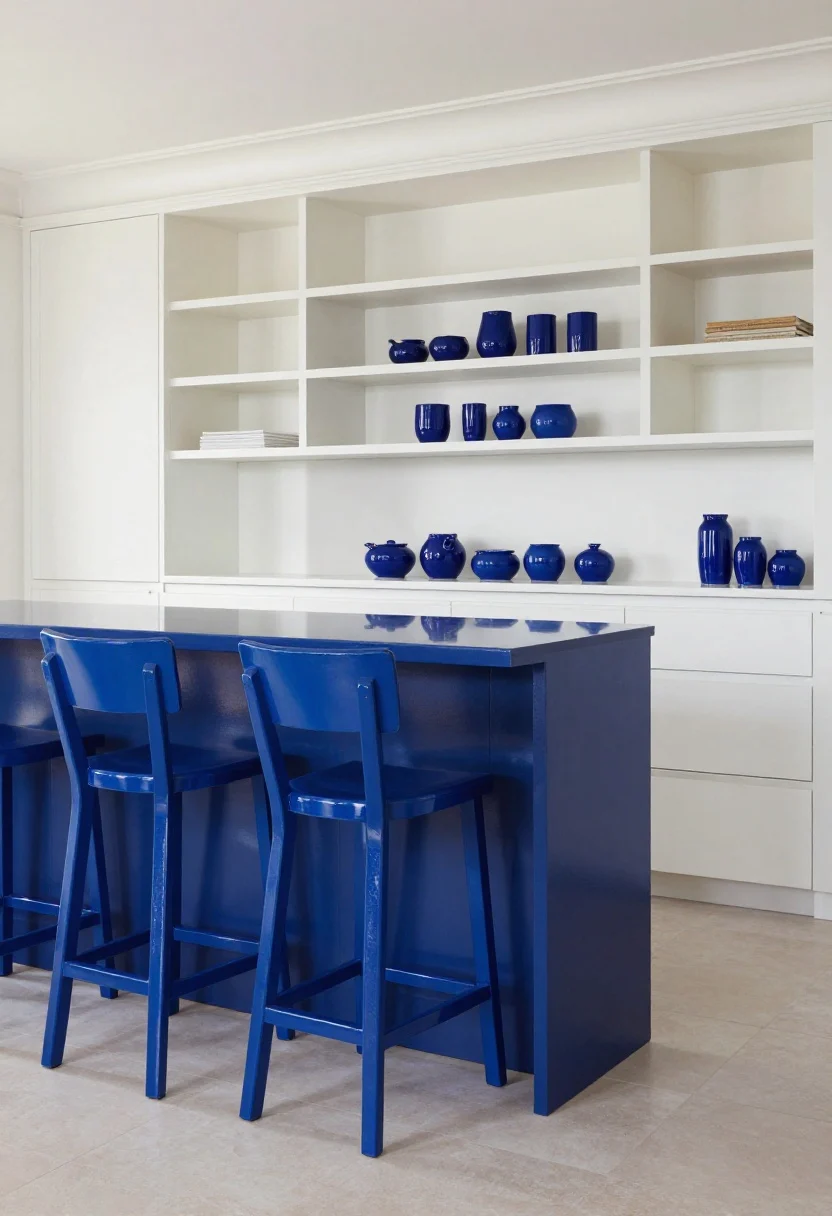
Here’s your dopamine hit: electric or cobalt blue used sparingly. It turns a neutral kitchen into a scene-stealer without repainting every inch. Think “one loud piece” energy.
How to Pull It Off
- Paint the island base or bar stools a punchy blue.
- Swap open-shelf ceramics for cobalt pieces that read like art.
- Keep surrounding finishes crisp and simple so the blue sings.
Pro tip: A glossy finish on accents reflects light and makes color look richer.
What to shop for: Counter stools, enamel cookware, open-shelf ceramics, accent paint.
7. Soft Sage Everything (Yes, Even Appliances)
© 2025 AI Illustrator — Inspiration Only
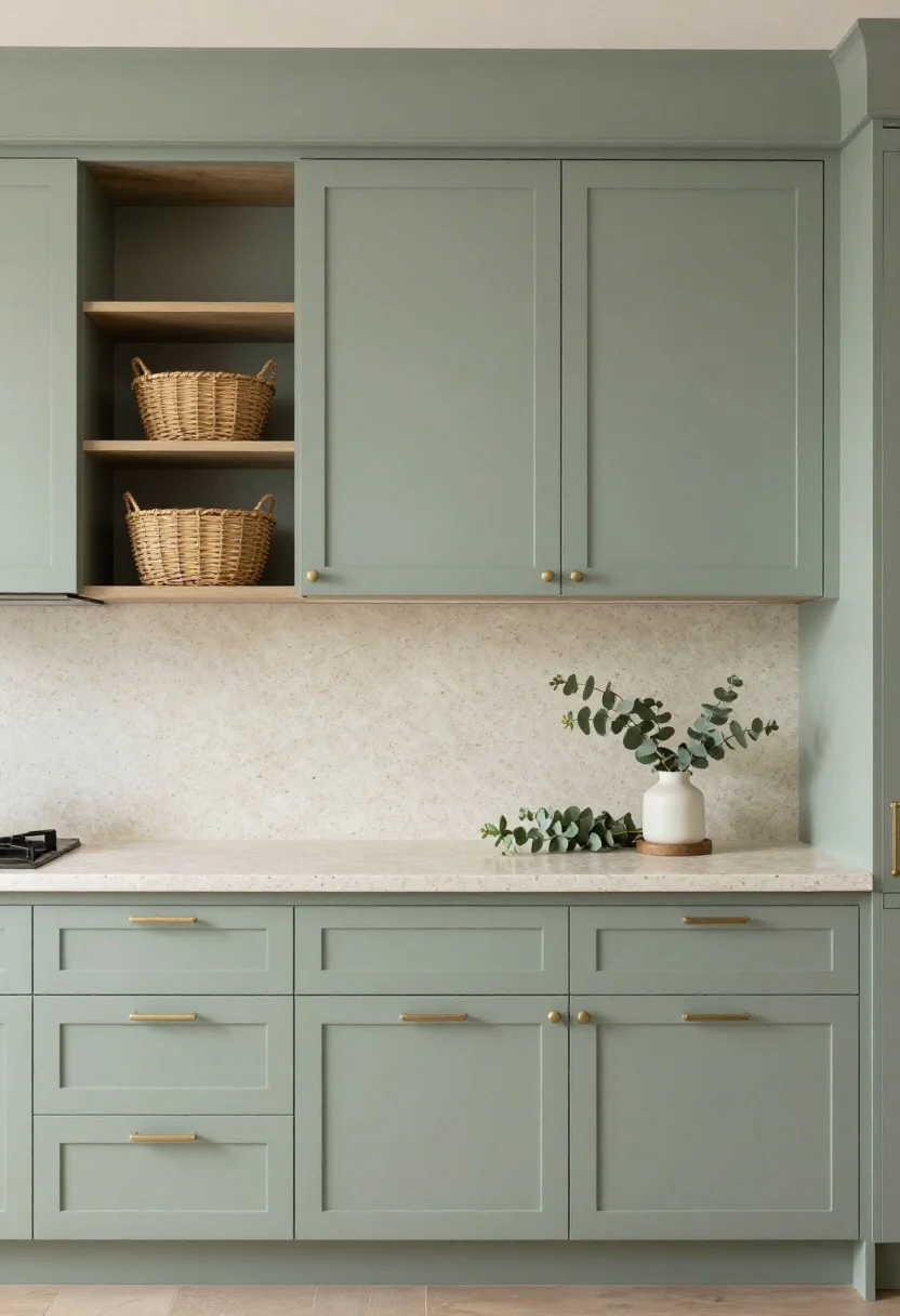
Sage green is the internet’s sweetheart for a reason—it’s calm, slightly gray, and flattering in any light. Use it on cabinets, or go bolder with a small appliance in sage for a color whisper that still counts as a pop.
How to Pull It Off
- Paint all cabinets sage in a satin finish; keep hardware brushed nickel for a spa vibe.
- Mix natural stone or terrazzo to add quiet interest.
- Layer in woven baskets and eucalyptus for texture-on-texture calm.
What to shop for: Brushed-nickel hardware, terrazzo-look counters, woven baskets, small appliances in muted tones.
8. Cherry Tomato Red (In All the Right Places)
© 2025 AI Illustrator — Inspiration Only
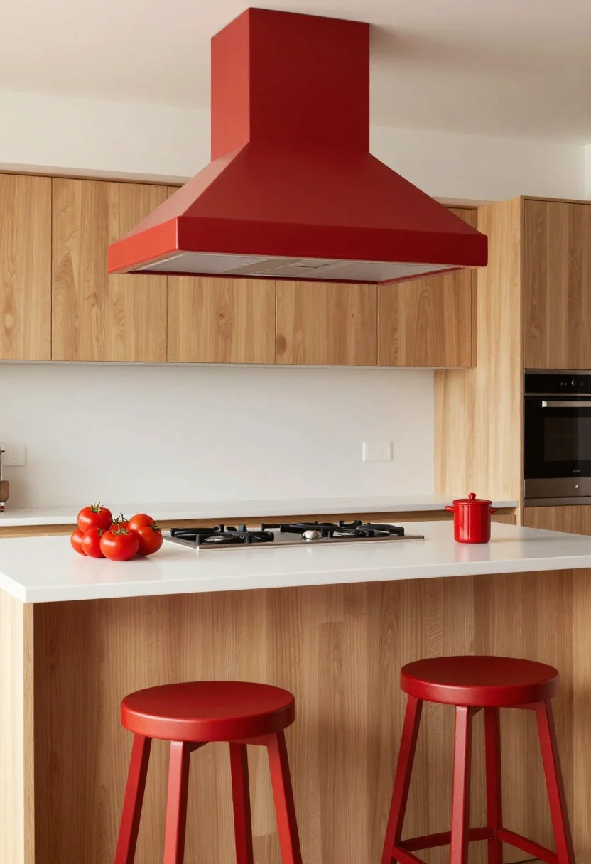
Red in the kitchen? Absolutely—if you pick a juicy, tomato red and keep it controlled. It wakes up a room and looks amazing with stainless steel, black, or pale wood.
How to Pull It Off
- Try a red range hood, island stools, or window trim for focused impact.
- Anchor it with light oak cabinets and a white backsplash so it feels fresh, not frantic.
- Repeat red three times (tea towel, utensil crock, art) to make it feel intentional.
Pro tip: Choose a slightly muted red if your kitchen is small—it’ll read sophisticated, not stop sign.
What to shop for: Metal stools, colored hoods, art prints, utensil crocks.
9. High-Contrast Wood + Ink Blue Walls
© 2025 AI Illustrator — Inspiration Only
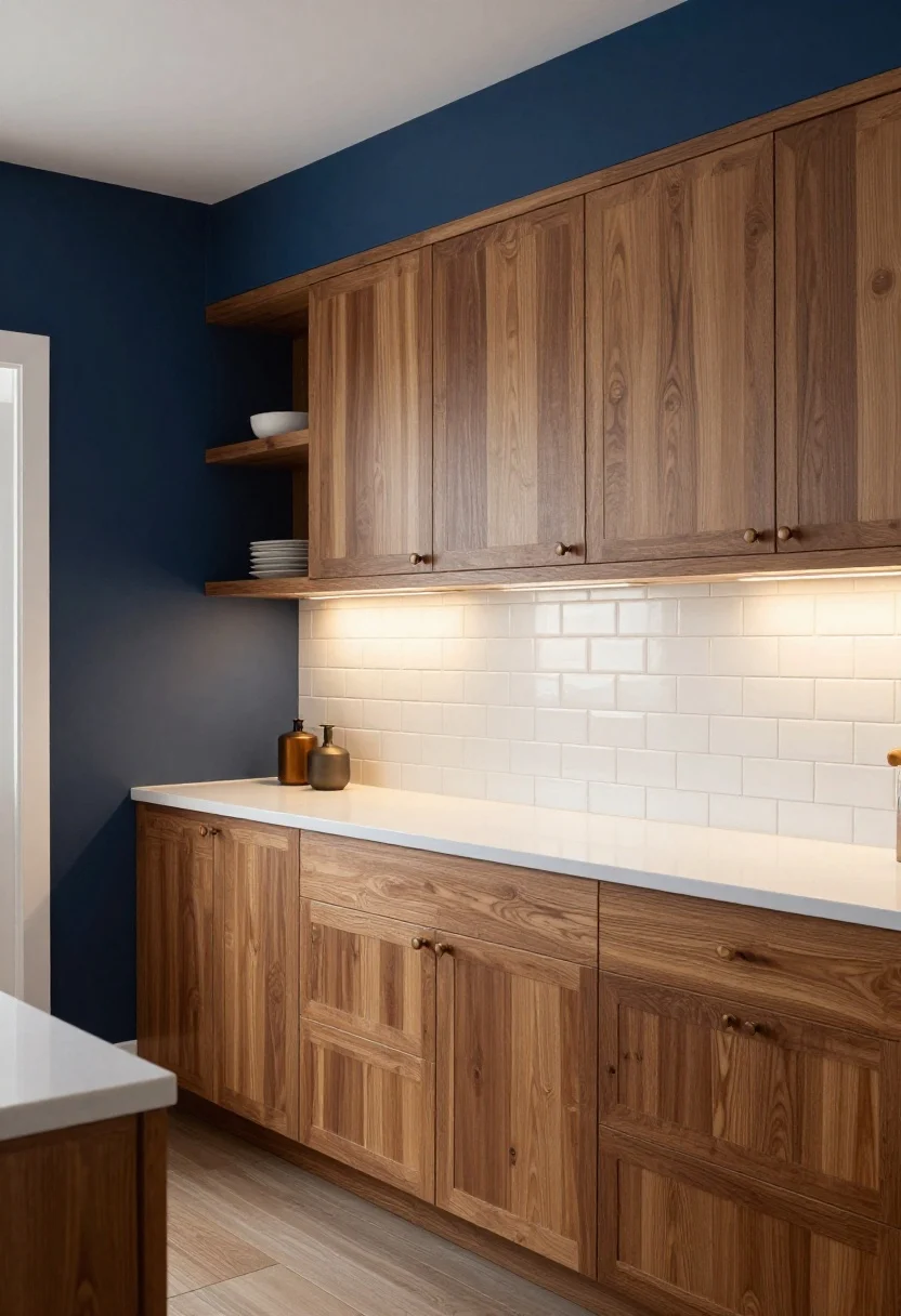
Flip the script: keep cabinets in natural wood and paint the walls a deep ink blue. It creates a cocoon effect that feels luxe at night but still grounded during the day. Add subtle metallics and you’ve got a boutique-restaurant vibe at home.
How to Pull It Off
- Pick mid-tone oak or walnut cabinetry—visible grain adds character against dark walls.
- Use soft white trim and glossy tile to bounce light around.
- Install dim-to-warm LEDs so color shifts from moody dinner to bright prep mode.
What to shop for: LED dimmers, glossy subway tile, oak shelves, warm metal knobs.
Color Pairing Cheat Sheet
- Cool tones need warmth: Navy, black, and ink blue love brass, wood, and creamy whites.
- Warm tones need texture: Terracotta, marigold, and red shine with natural fibers and stone.
- Neutrals need a pop: Bring one saturated accent back at least three times.
Practical Tips Before You Paint
- Test big swatches: Paint poster boards and move them around all day. Lights lie.
- Finish matters: Satin or semi-gloss for cabinets; matte or eggshell for walls.
- Prime like a pro: Especially over existing stain or laminate—bonding primer is your BFF.
- Mind undertones: Pair warm whites with warm colors; cool whites with cool palettes.
Styling That Makes Color Pop
- Repeat the hue: Use the same color in small doses (art, textiles, bowls) for cohesion.
- Vary textures: Matte paint plus glossy tile plus woven accents = depth.
- Edit counters: Clutter kills color. Group essentials on a tray and call it curated.
Lighting = Your Secret Weapon
- Layers win: Overhead + under-cabinet + sconces make every shade look designer-level.
- Temperature check: Aim for 2700K–3000K in kitchens for warmth without yellowing your walls.
Quick Mini-Makeovers (If You’re Color-Curious)
- Paint just the island or pantry door.
- Tile a small backsplash strip in a bold color.
- Swap bar stools, pendants, and a runner for instant impact.
Bottom line: Kitchens wear color well. Pick a palette that matches your energy (mellow sage? vibey cobalt?) and repeat it with intention. Your coffee will taste better. Probably.
FAQ
Q1: What’s the easiest place to add color without a full reno?
A: Start with the island, pantry door, or open shelves. They’re big enough to make an impact but simple to repaint if you change your mind.
Q2: How do I choose the right white to pair with bold colors?
A: Match undertones. Warm whites (hint of cream) love marigold, terracotta, and forest green. Cool whites (slightly gray) suit navy, black, and cobalt.
Q3: Will bold cabinet colors hurt resale?
A: Not if you keep it balanced. Choose classic deep tones (navy, forest, black) or paint just the lowers. You can always repaint before listing—cabinet color is one of the most fixable “renovations.”
Now go grab some samples, tape them up, and let your kitchen main-character itself.
Shop the Look on Amazon
Disclosure: As an Amazon Associate, this site may earn from qualifying purchases.
These product categories fit this article and give readers an easy next step when they are ready to shop.
- Warm metal pulls — Complements navy, green, and black schemes beautifully.
- Graphic flooring — Delivers bold black-and-white contrast instantly.
- Natural lighting — Adds texture and warmth to marigold or terracotta palettes.
- Shiny backsplash — Bounces light and sharpens high-contrast kitchens.
- Textured storage — Softens bold colors and keeps counters edited.
One Comment
Comments are closed.