I Tried 5 Small Bedroom Layouts — Only One Actually Made It Feel Bigger
Advertisement

My bedroom is the size of a large closet with dreams of being a suite. I tried five different layouts, rearranged furniture like I was training for the Olympic decathlon, and learned exactly what works (and what’s just cute on Pinterest). Here’s the tea—plus the one layout that finally made the room feel bigger instead of just… shrunken but tidy.
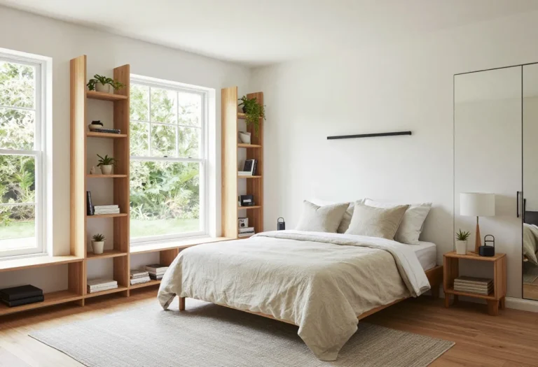
1. The “Centered Bed, Nightstands On Both Sides” Trap
© 2025 AI Illustrator — Inspiration Only
Ah yes, the classic. Bed smack in the middle, two matching nightstands like bookends, lamps perched politely. It looks symmetrical and very “hotel.” It also made my tiny room feel like a polite coffin.
The problem? Circulation space. You lose precious inches on both sides, and your eye keeps bouncing between furniture gaps instead of seeing one clean, open area. Cute in theory, claustrophobic in practice.
What I Tried
- Queen bed centered under the window
- Two small nightstands (14–16 inches wide)
- Matching table lamps to maximize vertical lines
Verdict
Not it. The symmetry felt grown-up, but the room shrank visually. Even with light bedding and minimal decor, I was playing human pinball getting to the closet. If your room is truly small, the centered layout is a space hog.
2. The “Bed Pushed Into The Corner” Moment
© 2025 AI Illustrator — Inspiration Only
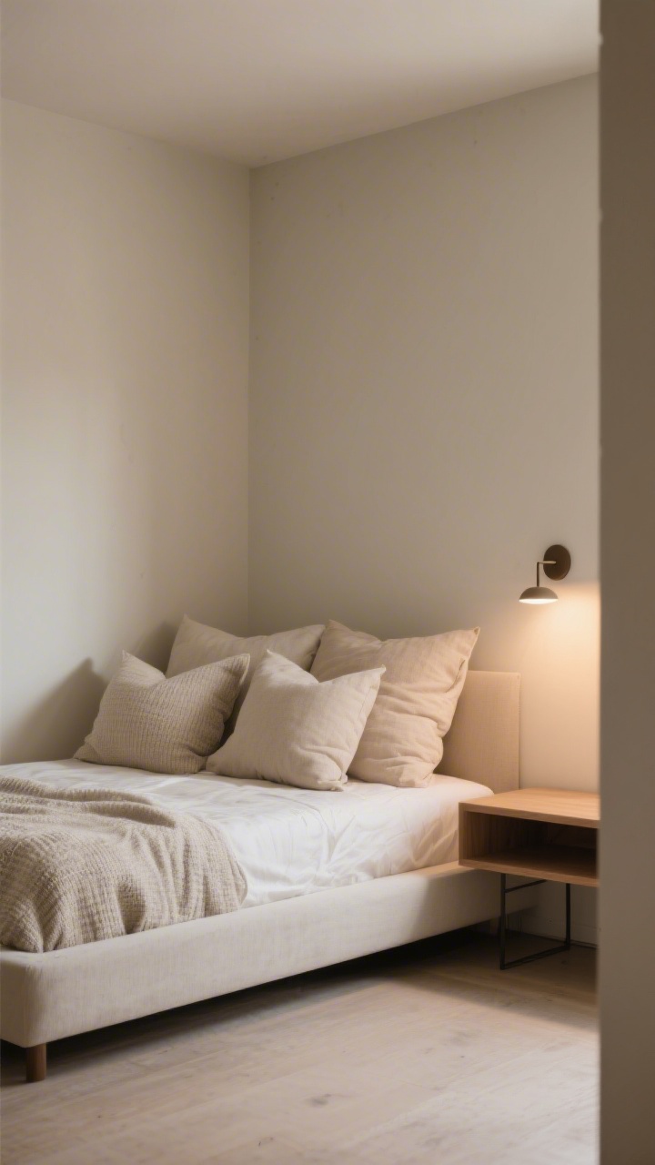
This one screams dorm room, but hear me out—it can work if you’ve got the right bed frame and textiles. I pushed the bed tight into the corner, against one long wall and the head against another. Boom: an instant open floor area.
Follow our WhatsApp Channel for easy bedroom ideas, small-space tips, storage tricks, and budget decor fixes.
Follow on WhatsAppBut there’s a catch. Corner beds can look accidental unless you layer the corner so it feels intentional.
What I Tried
- Platform bed with no footboard (less visual bulk)
- Overlapping pillows arranged L-shaped into the corner
- One nightstand on the open side + a sconce for the corner side
Verdict
Promising, but still meh. The floor felt more open, but the room skewed “crash pad.” If you love a cozy, nook vibe, this is decent. If you want your space to feel truly bigger, it still reads a little cramped, IMO.
3. The “Under-The-Window Headboard” Strategy
© 2025 AI Illustrator — Inspiration Only
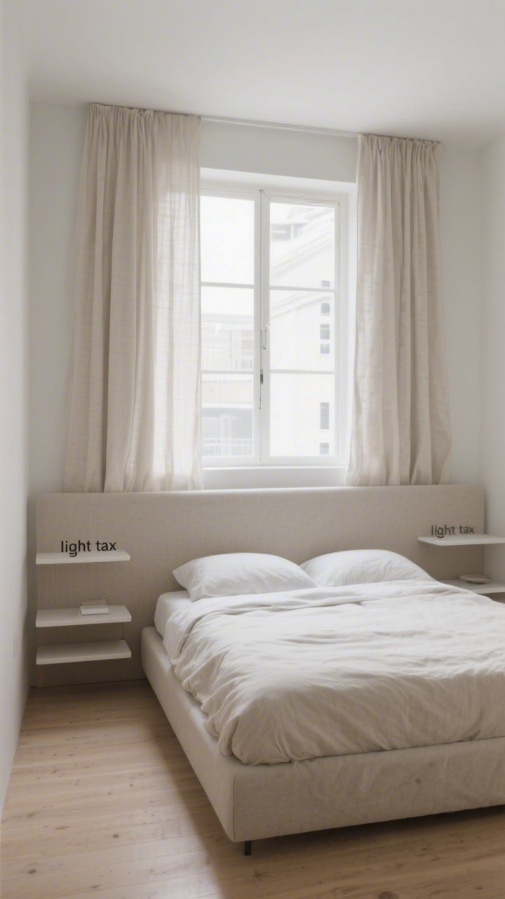
Designers love this move: put the headboard under the window to center the bed on a focal point. It can be gorgeous. But in a small room with standard windows, you end up chopping the light and stacking lines in a way that shortens the room visually.
Plus, curtains and headboard textures can get into a fight. Spoiler: the curtains win, and your headboard sulks.
What I Tried
- Low-profile headboard aligned under the sill
- Simple linen curtains hung high and wide
- Two floating shelves as nightstands to save floor space
Verdict
Pretty but not bigger. It photographed beautifully (FYI, my camera loved this layout), but in real life, the headboard blocked the light path and made the wall feel busier. Great for medium rooms; in tiny rooms, it’s a light tax you can’t afford.
4. The “Diagonal Bed For Drama” Detour
© 2025 AI Illustrator — Inspiration Only
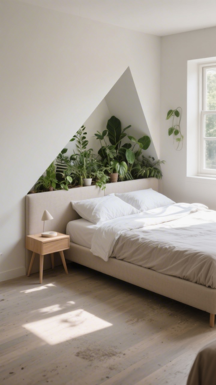
I know, I know—diagonal beds are the drama queens of layout. The idea is that the angle “breaks up” the boxy shape and creates flow. What it actually created: dead zones behind the headboard and a dust bunny retirement village.
It did add personality, but I sacrificed usable space to get it. Not a trade I’d make again when every inch matters.
What I Tried
- Full bed placed from corner to center at a 45-degree angle
- Plants filling the negative space behind the headboard
- One triangular nightstand to match the angle
Verdict
Fun but impractical. If your room is small but not tiny, this can be a vibe. In a legit small bedroom, it eats floor space and complicates traffic patterns. Also, making the bed? A core workout.
5. The “Wall-To-Wall Daybed Disguise” Trick
© 2025 AI Illustrator — Inspiration Only
Turning the bed into a faux daybed is a neat hack if your bedroom doubles as an office or studio. I rotated the bed so it sat lengthwise against a wall, loaded it with big pillows, and called it a lounge by day.
It definitely changed the mood—more airy, hangout-friendly—but it also shrunk the perceived length of the bed wall, which can backfire in a narrow room.
What I Tried
- Twin XL with a tailored coverlet and bolster pillows
- Wall-mounted swing-arm sconce instead of a lamp
- Narrow console behind the “sofa” look for hidden charging
Verdict
Great for multi-use; not the winner for “feels bigger.” If you WFH from your bedroom, this is a lifesaver. But if you want standard-bed energy and true spaciousness, it reads more functional than expansive.
6. The “Storage-First Platform + Floating Everything” Play
© 2025 AI Illustrator — Inspiration Only
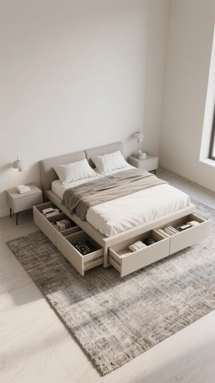
I went full minimalist: platform bed with deep drawers, floating nightstands, and a floating dresser. No legs touching the floor except the bed itself. The room felt cleaner, and I gained storage—but it still felt like a small room that was simply neat.
The issue was visual weight. Even minimal furniture can look heavy if it’s all solid-faced. Breaking up the mass matters.
What I Tried
- Storage platform with four drawers (goodbye, under-bed chaos)
- Mounted nightstands at the same height as the mattress
- Large rug that extends at least 24 inches on the open sides
Verdict
Organized but not larger. A+ for practicality. Slightly clinical for vibe. It taught me that smart storage is key, but you still need visual openness to trick the eye.
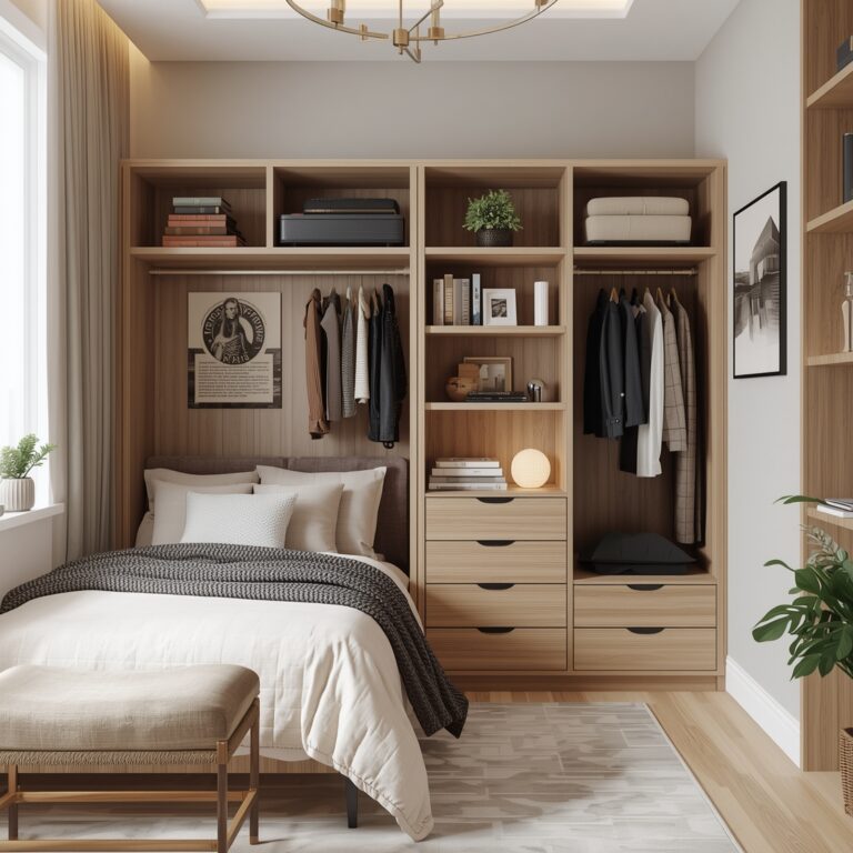
7. The Winner: “Off-Center Bed With One Nightstand + Tall Wardrobe Opposite”
© 2025 AI Illustrator — Inspiration Only
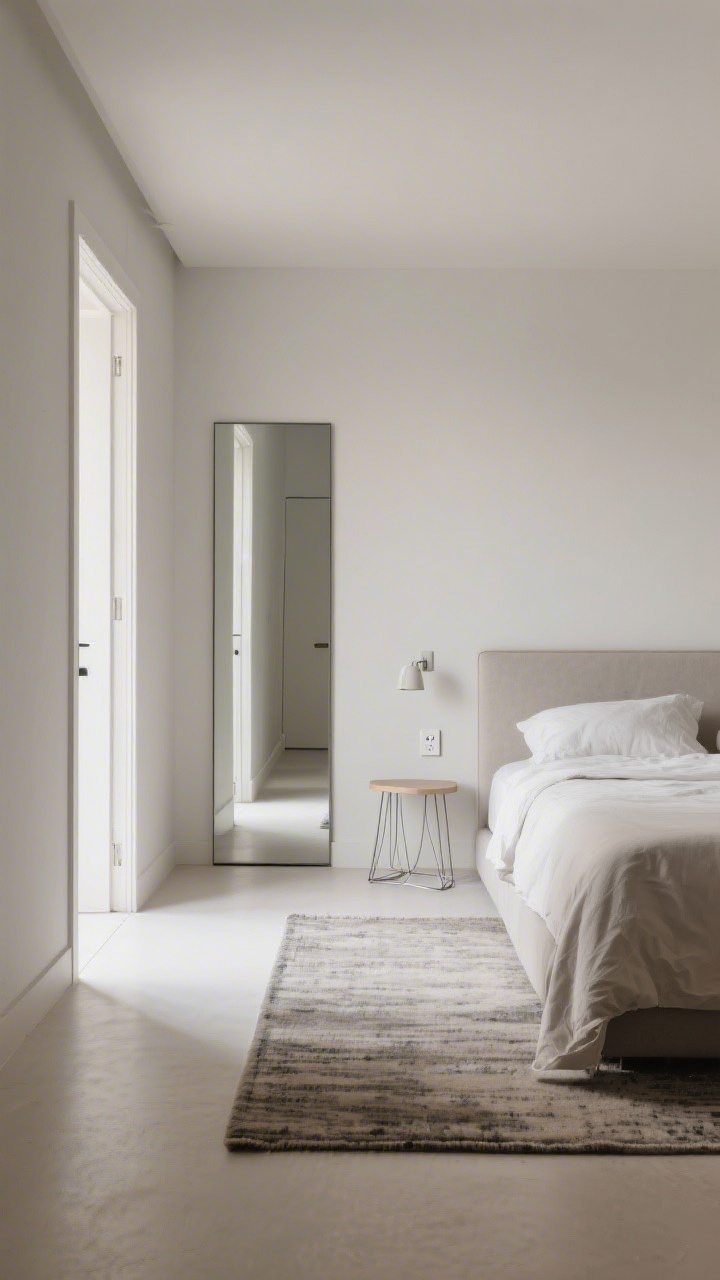
This is the layout that finally made my bedroom feel bigger. I slid the bed off-center along the long wall, left about 24–30 inches on one side for a single nightstand, and kept the other side tight (about 8–12 inches). Opposite the foot of the bed, I placed a tall, narrow wardrobe with legs and a mirrored door.
Here’s why it works: it creates one generous circulation lane, opens up a large, continuous floor area, and balances the visual height with a tall piece across from the bed. The mirror bounces light, and the leggy wardrobe shows more floor, which is huge for tiny rooms.
The Setup
- Bed Placement: Along the long wall, slightly off-center. No footboard. Low-profile headboard.
- Nightstand: One on the wider side only. Choose an open-base or wire-frame style to keep it airy.
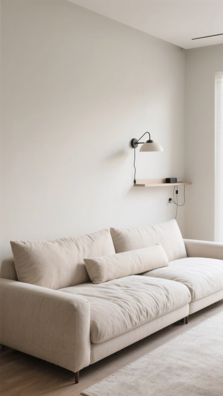
- Lighting: A plug-in sconce above the tight side so you’re not sacrificing function.
- Wardrobe: 20–24 inches deep, on legs, mirrored or glass front. Place opposite the foot or slightly offset to maintain a sightline.
- Rug: Large enough to slide 2/3 under the bed, extending into the open lane. Light, low-contrast pattern.
Why It Feels Bigger
- Continuous Floor: Your eye follows the open lane and rug, reading the room as longer.
- Asymmetry With Intention: Off-centering the bed reduces “filler” space and turns one side into a functional zone.
- Vertical Balance: The tall wardrobe pulls the gaze upward, while the low bed keeps the lower half calm.
- Reflections: Mirrored wardrobe doors amplify light without adding clutter. FYI: this is a cheat code.
Pro Tips To Nail It
- Mind The 30-Inch Rule: Keep at least one walkway around 30 inches wide for comfort; 24 is the bare minimum.
- Think Legs: Choose pieces with visible legs to expose more floor—instant breathing room.
- Cut The Contrast: Keep big surfaces in similar tones (walls, rug, bedding). High contrast chops the space.
- Go Vertical: Tall art or a vertical panel behind the headboard draws the eye up and lengthens the wall.
- Hide Cords: Use under-bed cord channels or adhesive clips so the open lane looks clean.
What To Avoid
- Bulky Footboards: They block the line of sight and make the bed feel like a barricade.
- Short, Wide Dressers: They eat wall space and visually squat the room. Tall and narrow wins.
- Tiny Rugs: A small rug makes the room feel chopped up. Size up or skip it entirely.
Style Moves That Seal The Deal
- Monochrome Moments: Match the wall color to your headboard or use a tonal slipcover to blur edges.
- Sheers + Blackout Combo: Hang sheers for daylight and add a discreet blackout roller for sleep. Soft light = airy room.
- One Big Art Piece: Above the bed or wardrobe. One statement beats a cluster of small frames in a tiny space.
Final take? Small bedrooms aren’t about squeezing in symmetry—they’re about choosing one generous path and letting everything else support it. The off-center bed plus tall wardrobe trick made my room feel open, intentional, and actually livable. If you try just one layout from this list, make it this one. Your shins (and your square footage) will thank you.