Dream Kitchen Ideas You’ll Want to Copy Asap (and Brag About Later)
Advertisement

You know that kitchen you keep saving on Pinterest at 1 a.m.? Let’s make it real. These ideas are high-impact, renter-friendly-ish, and actually doable—no full gut reno required. Grab a coffee (or a mocktail), and let’s design the kitchen your future self will not shut up about.
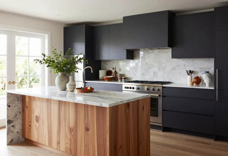
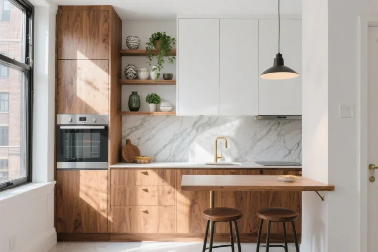
1. Go Big On The Backsplash (Like, To The Ceiling)
© 2025 AI Illustrator — Inspiration Only
When in doubt, tile higher. Taking your backsplash to the ceiling makes your kitchen feel taller, sleeker, and way more custom—even if your cabinets came flat-packed. Bonus: it’s an instant Zoom background flex.
Material Moves
- Zellige or handmade tiles: Soft, imperfect shine that looks artisanal. Pair with matte fixtures for balance.
- Slab backsplash: One continuous piece of quartz, marble, or porcelain = zero grout lines and maximum drama.
- Contrasting grout: White tile with charcoal grout adds graphic punch and hides spaghetti mishaps.
Pro Tips
- Run tile behind your range hood to elongate the wall—chef’s kiss.
- Finish the edges with a metal trim (schluter) so it looks built-in, not DIY-ish.
- Renting? Try peel-and-stick tile in a herringbone pattern for big impact without big commitment.
2. Layer Lighting Like You Mean It
Overhead cans alone = airport vibes. Instead, build a three-layer lighting plan so every task, mood, and midnight snack looks good.
The Trio You Need
- Ambient: Dimmable recessed lights or a flush mount to set the overall glow.
- Task: Under-cabinet LED strips so you can actually see your chopping board. Get warm 2700–3000K.
- Accent: Pendants over the island or a sculptural sconce by display shelves. A little jewelry goes far.
Pro Tips
- Hang pendants 30–36 inches above the countertop; space them 24–30 inches apart.
- Match metal finishes but vary shapes—think globe pendants with linear hardware.
- Install smart dimmers so mornings feel bright and evenings feel cozy without swapping bulbs.
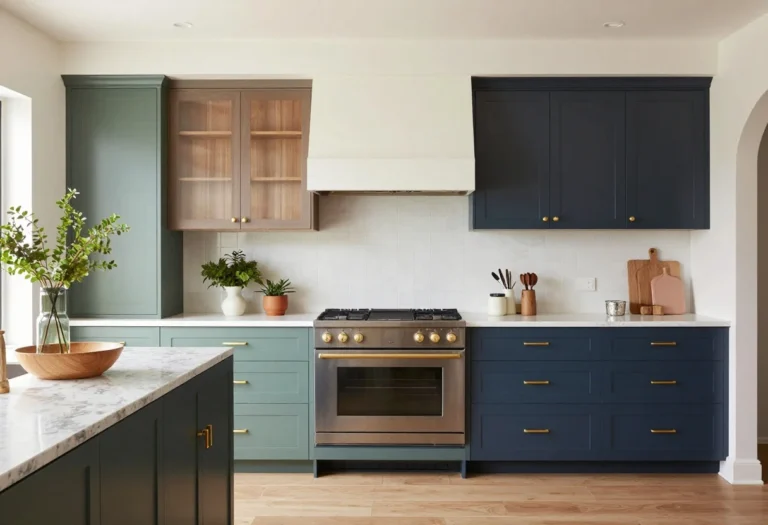
3. Color-Forward Cabinets (Without Regret)
© 2025 AI Illustrator — Inspiration Only
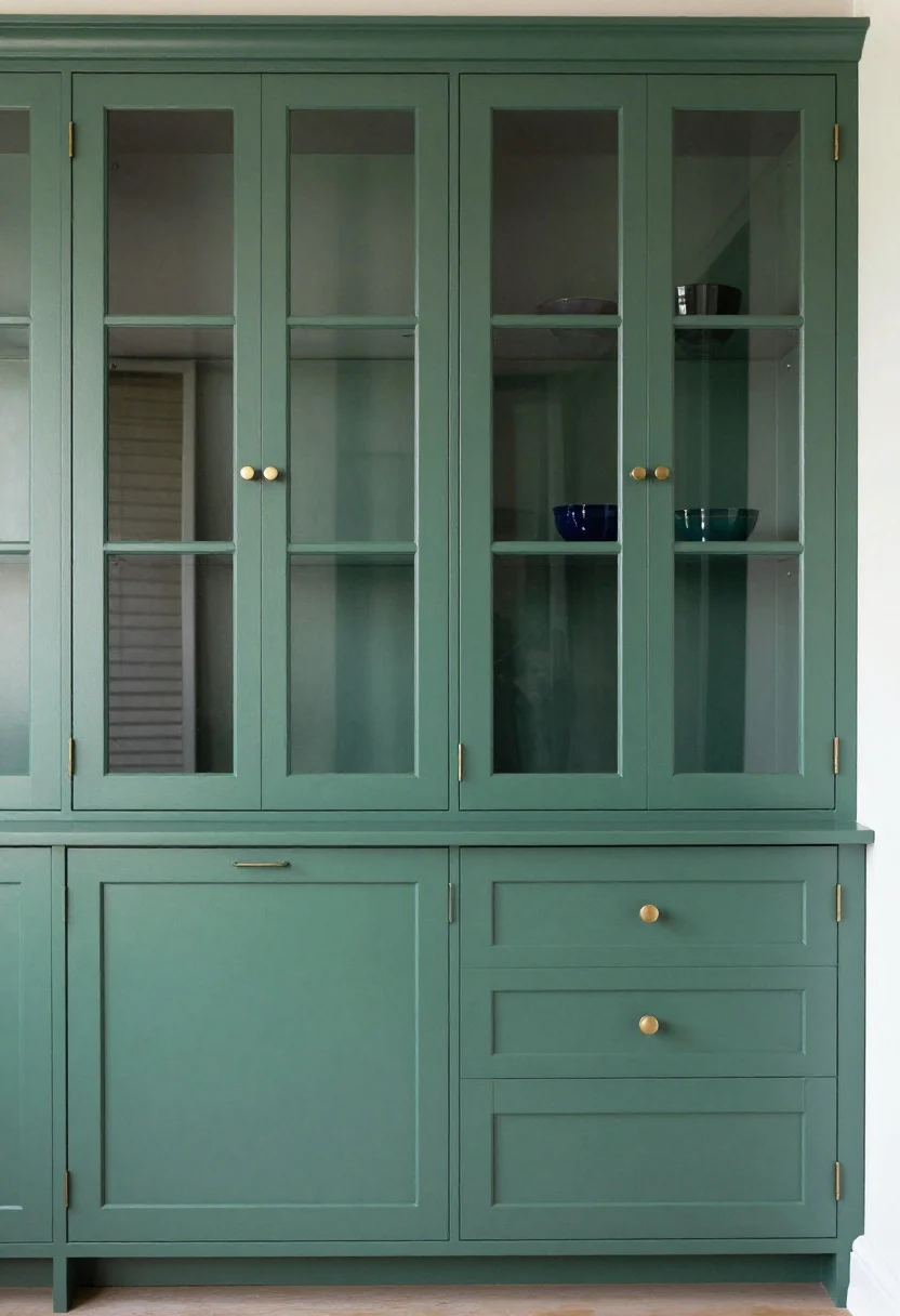
White kitchens are classic, but color is the quickest way to shout “custom.” Think moody forest green, inky navy, or muted mushroom for that editorial look. Not ready to commit? Do the lowers only and keep uppers light.
Shade Strategy
- Light kitchens: Try soft sage or French gray. Airy, but not boring.
- Low-light spaces: Embrace drama with deep teal or charcoal. Add brass to warm it up.
- Small kitchens: Painted Shaker doors in a mid-tone hide fingerprints (FYI, glossy shows everything).
Pro Tips
- Use a spray finish or a fine foam roller for that factory-smooth look.
- Swap dated hardware for chunky pulls or edge pulls. It’s a mini facelift.
- Inside secret: Paint the interior of a glass-front cabinet a slightly lighter tint for depth.
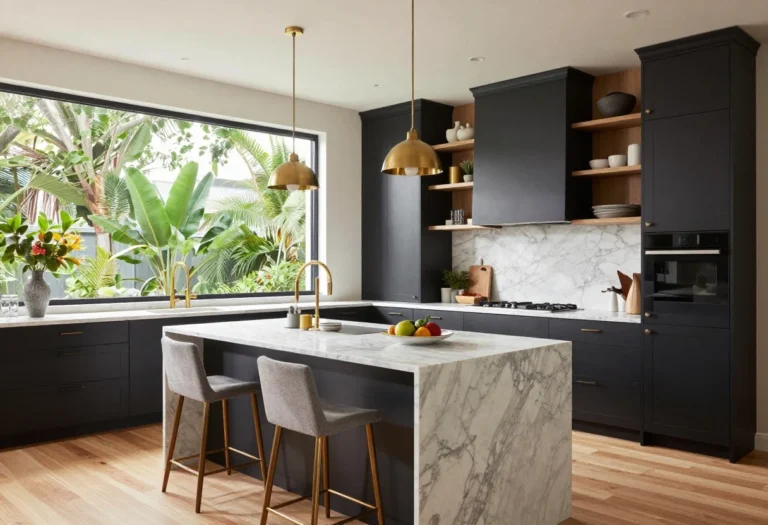
4. Statement Island That Actually Works
© 2025 AI Illustrator — Inspiration Only
Follow our WhatsApp Channel for easy bedroom ideas, small-space tips, storage tricks, and budget decor fixes.
Follow on WhatsApp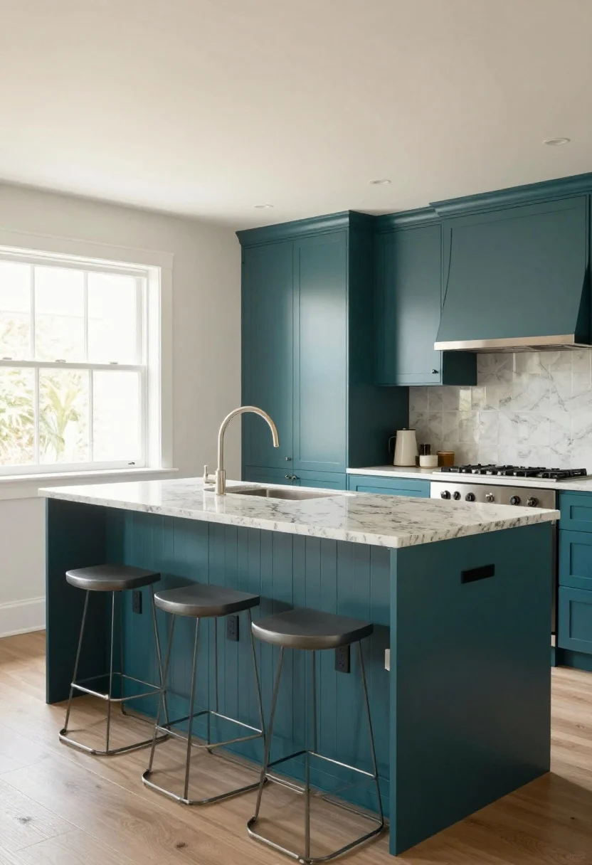
Your island is the hangout spot, buffet line, homework station, and gossip bench. Make it beautiful and functional.
Design Moves
- Waterfall countertop: Stone wrapping the sides = instant designer energy.
- Two-tone moment: Paint the island a contrasting color to frame the space.
- Fluted or reeded panels: Texture that hides scuffs and looks custom. Chef-approved.
Size + Seating
- Leave 36–42 inches of clearance all around so traffic flows (no elbow wars).
- Counter stools need 24–26 inches of height; give each seat 20–24 inches of width.
- Overhang of 10–12 inches = knees are happy, tailoring is less awkward.
Storage Smarts
- Deep drawers for pots > cabinets you crawl into.
- Hidden trash pull-out on the end cap. You’ll thank me later.
- Power outlets under the counter lip for mixers and laptops. Subtle and so useful.
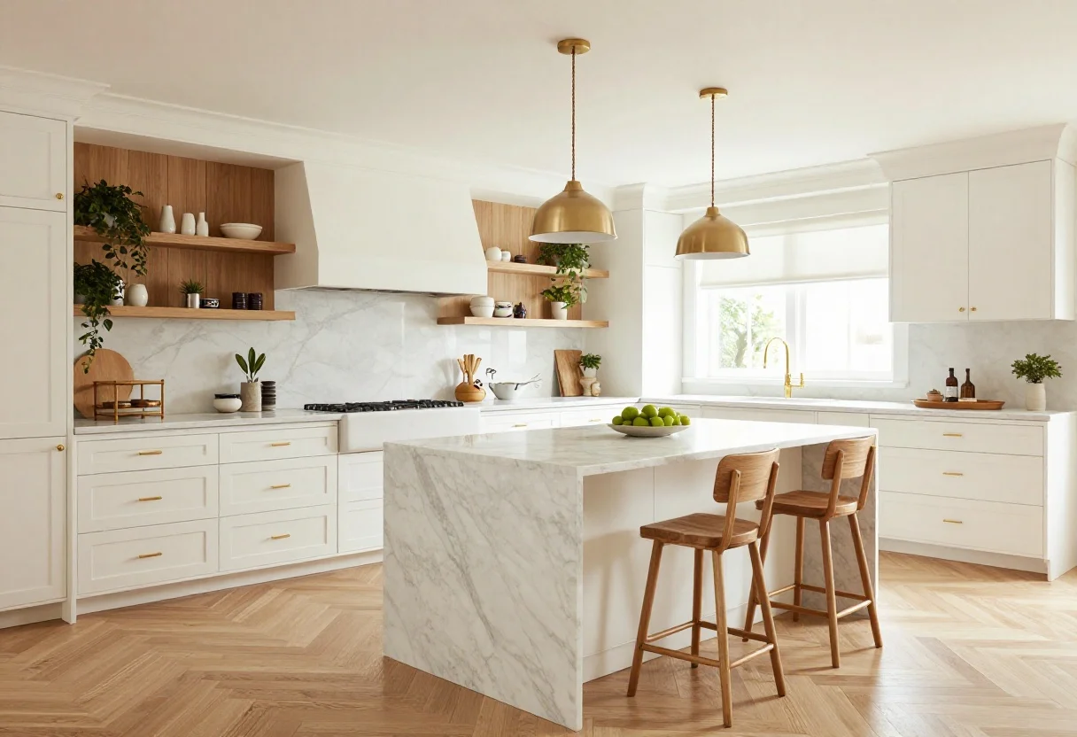
5. Open Shelving Without The Chaos
© 2025 AI Illustrator — Inspiration Only
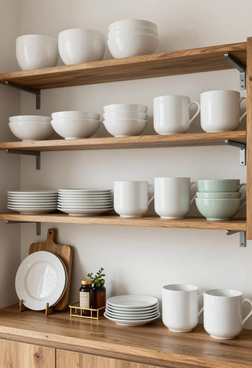
Yes, open shelves can look chic—not like a garage sale—if you curate. Keep them low-traffic and high-style, then stash clutter behind closed doors.
Curate Like A Stylist
- Stick to 2–3 colors and repeat: white ceramics, wood tones, and one accent color.
- Mix heights and textures: stack plates, lean a vintage cutting board, add a plant.
- Group in odd numbers—threes and fives read balanced without being stiff.
Installation IQ
- Use chunky brackets or floating steel supports; load limit matters (please don’t test with cast iron).
- Mount between 16–20 inches above the counter for easy reach and clean sightlines.
- Run a short gallery rail to corral oils and spices. Practical, photogenic, done.
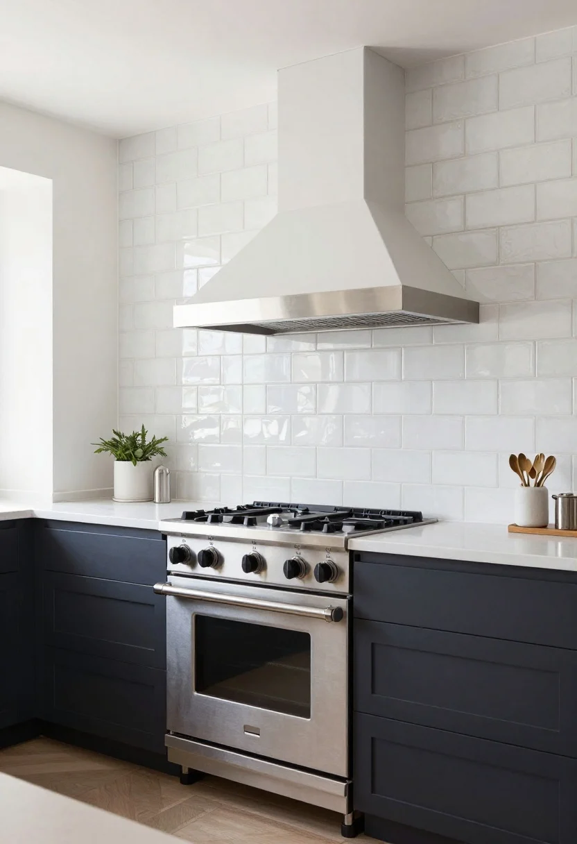
6. Appliances That Disappear (Or Make A Statement)
© 2025 AI Illustrator — Inspiration Only
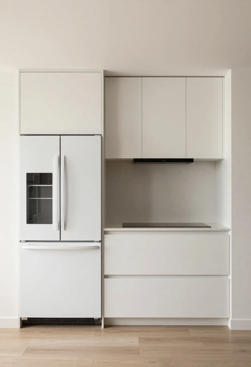
Pick a lane: either panel-ready and seamless or pro-style and proud. Both scream “custom,” just in different accents.
If You Love Minimalism
- Panel-ready fridge and dishwasher: Match your cabinet fronts for a quiet, luxe vibe.
- Induction cooktop with a flush trim. Sleek, fast, easy to clean.
- Low-profile hood hidden in cabinetry so the backsplash can shine.
If You Want Drama
- Pro range with chunky knobs and a statement color (matte black, cobalt, even burgundy—IMO, gorgeous).
- Standalone hood with natural wood or plaster cladding. Sculptural but functional.
- Glass-front beverage fridge for entertaining cred.
Smart Upgrades
- Look for 36-inch counter-depth fridges to keep lines clean in tight spaces.
- Choose paneled appliance pulls that match cabinet hardware widths for harmony.
- If replacing isn’t in the budget, swap to unified finishes and add a sleek magnetic cover to older dishwashers.
7. The Finishing Touches That Make It Designer
© 2025 AI Illustrator — Inspiration Only
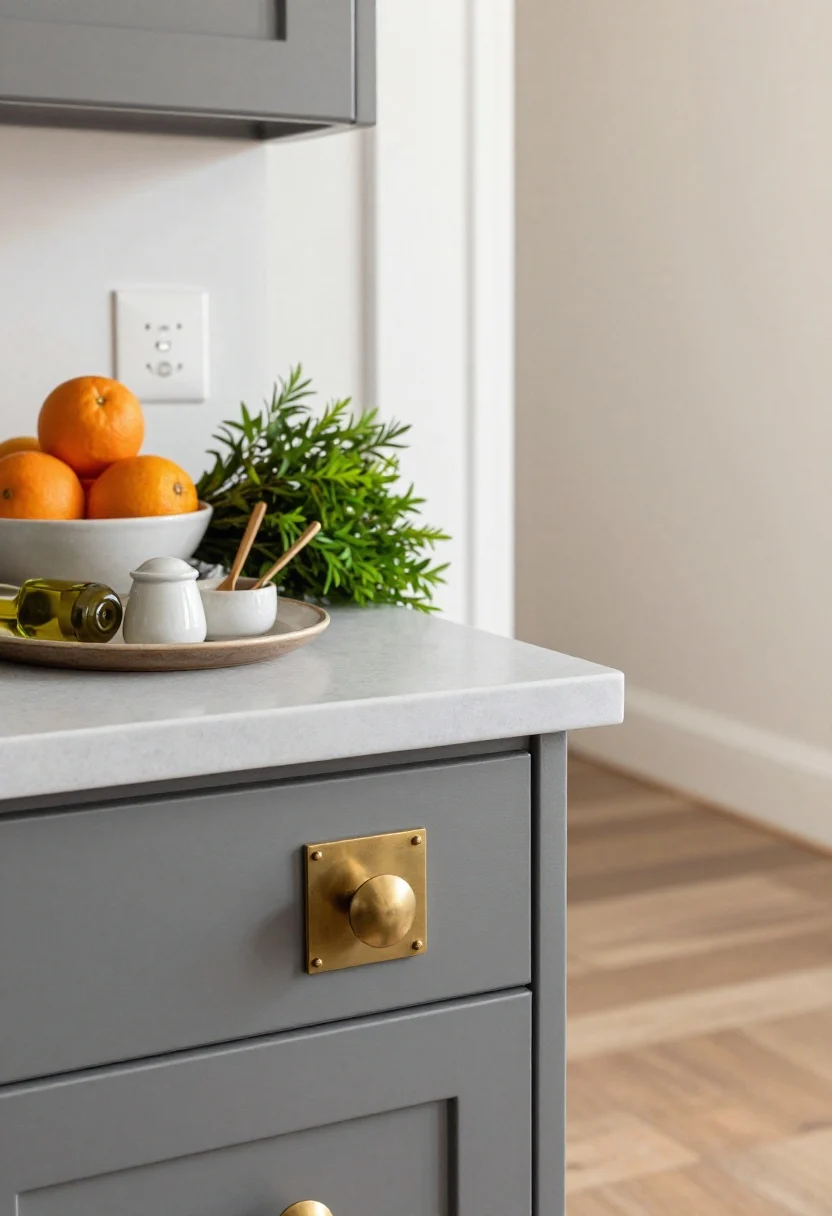
The difference between “nice kitchen” and “who’s your designer?” is in the details. Layer texture, art, and lived-in elements that feel effortless but intentional.
Countertop Styling (Keep It Lean)
- One pretty tray with olive oil, salt cellar, and a wood spoon—done.
- Fresh element: a vase with market greens or a bowl of citrus for a hit of color.
- Hide the toaster unless it’s attractive; appliances aren’t decor, FYI.
Hardware + Metals
- Mix metals, but limit to two: e.g., brushed brass hardware + black lighting.
- Choose substantial pulls (5–8 inches) for drawers; they feel luxe and function better.
- Swap switch plates to matte or screwless for a clean finish. Tiny upgrade, big polish.
Floor + Rugs
- Runner in a performance or vintage-inspired rug adds softness and hides crumbs like a champ.
- If replacing floors, run planks parallel to the longest wall. It visually expands the room.
- Matte finishes on wood or LVP look more high-end than glossy. Trust.
Art + Personality
- Leaning art on the counter or a tiny framed piece on a shelf humanizes the space.
- Hang a small pinboard for recipes and postcards—organized, not cluttered.
- Swap standard soap bottles for refillable glass or ceramic. It’s the little 1% upgrades.
Quick Styling Formula: Every surface gets one hero piece, one functional piece, and one natural element. That’s it. Breathe.
Bonus Mini-Checklist
- Cabinet doors aligned? Adjust hinges for perfect reveals.
- Caulk lines tidy? Re-caulk where needed for that “installed yesterday” look.
- Under-sink chaos? Add pull-out bins and label. You’ll feel 12% more zen immediately.
Ready to build your dream kitchen? Start with one upgrade—maybe those pendants or a bold island paint—and keep layering. Before you know it, you’ll be casually inviting friends over to “test the lighting” with a charcuterie board. Spoiler: they’ll ask for your sources. And yes, you can absolutely take the credit.