Cozy Winter Bedroom Color Schemes That Feel Warm and Relaxing

When the days grow short and the temperature drops, the bedroom becomes the refuge you return to each night. A thoughtful color scheme can turn that space into a gentle cocoon, inviting you to unwind without the chill of winter seeping in. Below are seven curated approaches that blend hue, texture, and light to create a bedroom that feels both warm and calming. Each idea includes practical ways to bring the palette to life, as well as considerations that help you decide if it matches your lifestyle.
1. Embrace Soft Greige with Warm Wood Accents
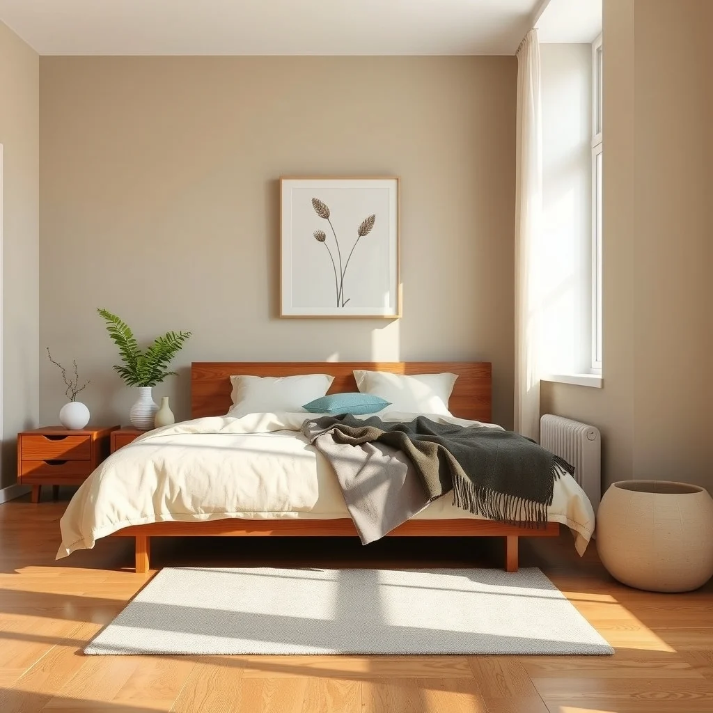
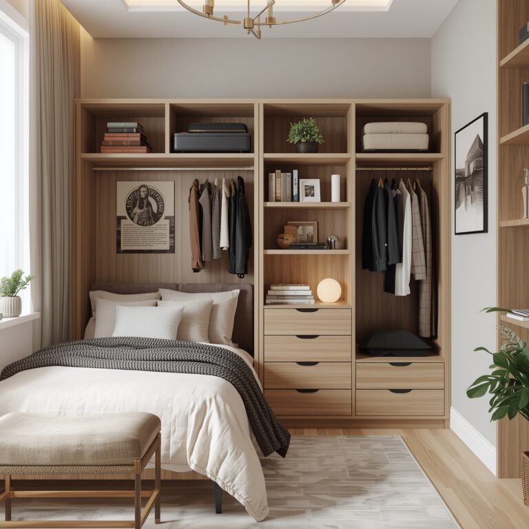
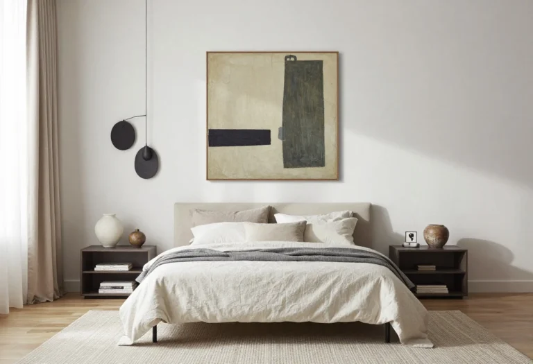
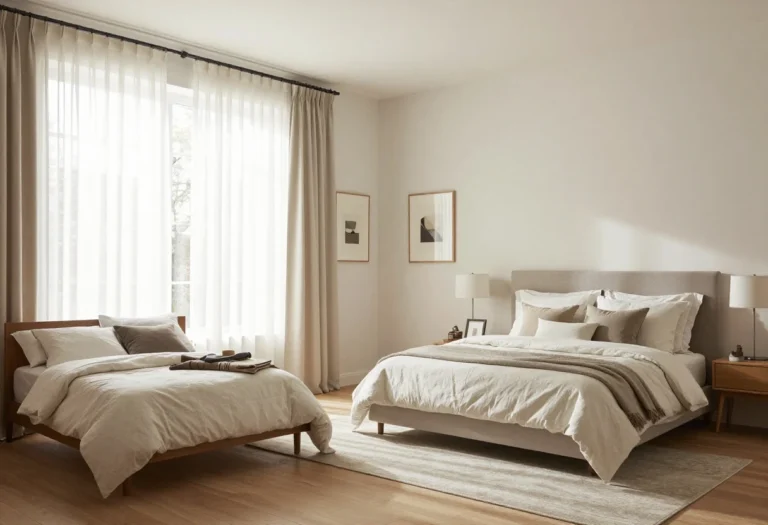
Greige—a blend of gray and beige—offers a neutral backdrop that feels comforting rather than stark. Pairing this muted tone with natural wood, such as a walnut headboard or oak nightstands, introduces subtle warmth that echoes the season’s muted light. The key is to choose wood finishes that lean toward honey or amber rather than cool ash, because those golden undertones reinforce the snug atmosphere. When you layer a plush, off‑white duvet over a greige duvet cover, the textures interact to soften the overall look, making the room feel inviting without overwhelming the eye. A practical tip is to keep the greige on larger surfaces—walls and larger furniture—while reserving the richer wood tones for accent pieces; this balance prevents the space from feeling heavy.
2. Add Deep Olive with Creamy Linens
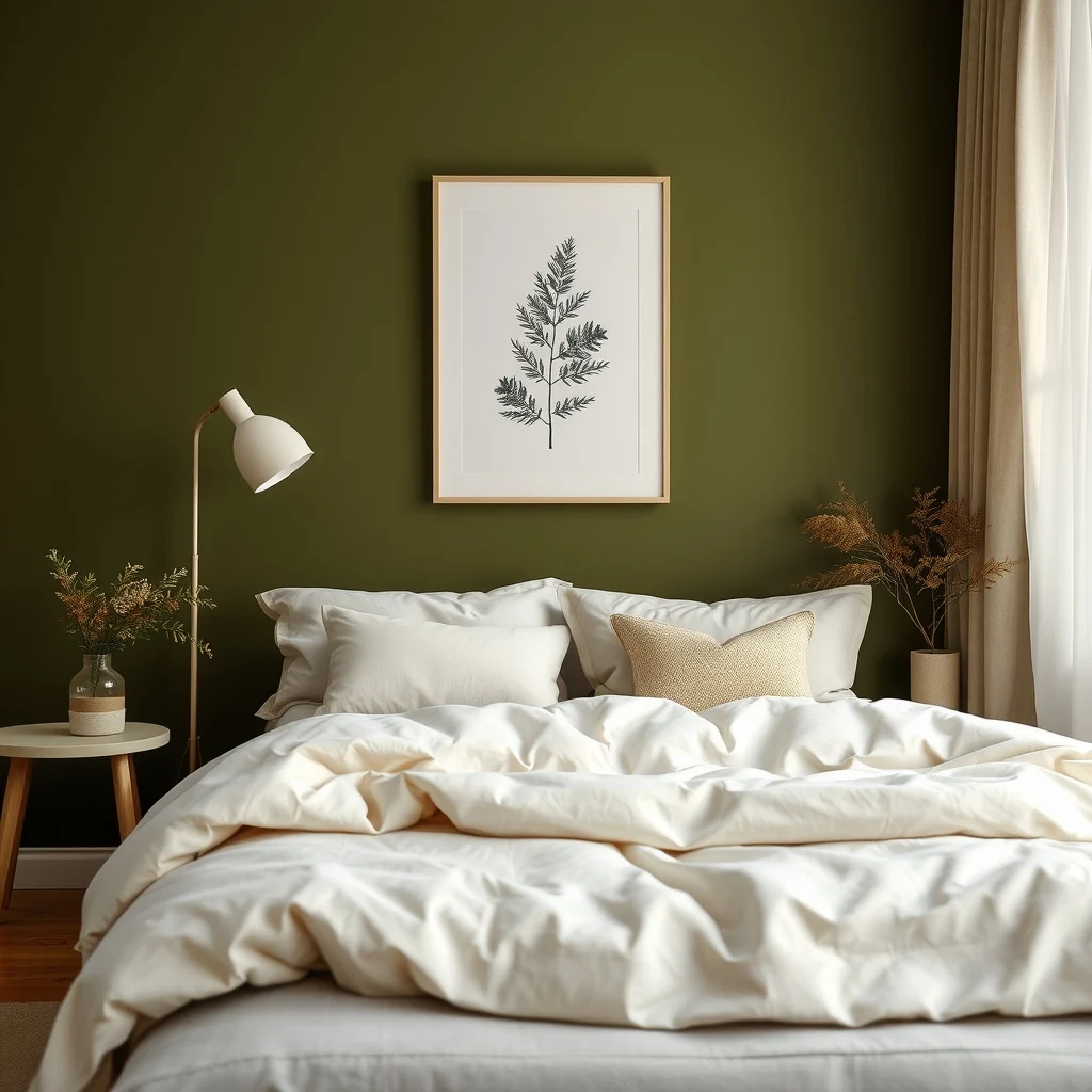
Deep olive brings a touch of the outdoors inside, recalling evergreen branches against a winter sky. When paired with creamy linen bedding, the contrast feels soothing rather than bold. Olive works especially well on a feature wall behind the bed, allowing the hue to anchor the room while the surrounding walls stay light. The matte quality of linen drapes and pillow shams adds a tactile softness that counters the richness of the paint. To avoid a room that feels too dark, incorporate a light wood dresser and brass or copper hardware, which reflect ambient light and keep the palette from sinking. This combination works best in bedrooms with at least a modest amount of natural light; in a windowless space, consider a lighter shade of olive or add a floor lamp with a warm bulb.
3. Layer Muted Terracotta with Soft White
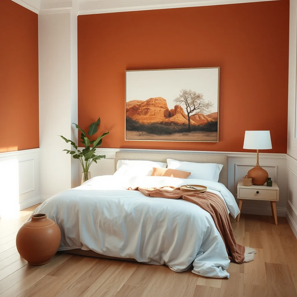
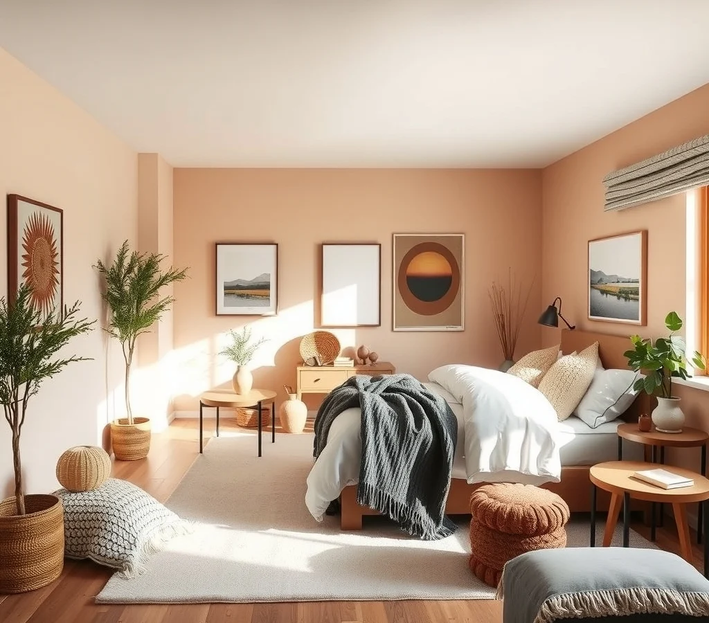
Terracotta evokes the glow of a hearth fire, and when muted—think dust‑kissed rust rather than bright orange—it becomes a subtle source of warmth. Painting the lower half of the walls in this shade creates a grounded feel, while the upper portion stays soft white, preserving an airy sense of height. A terracotta upholstered bench at the foot of the bed adds a tactile element that invites you to sit and stretch. Complement the bench with a white, chunky knit throw; the contrast of rough and smooth textures deepens the sense of comfort. One limitation to watch is that terracotta can show dust more readily, so choose a finish that is easy to wipe down if you have pets or children.
4. Mix Warm Charcoal with Blush Accents
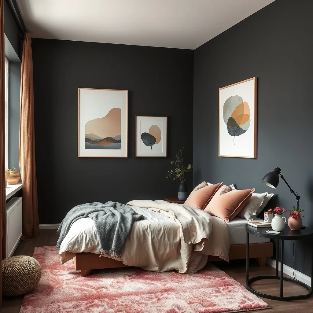
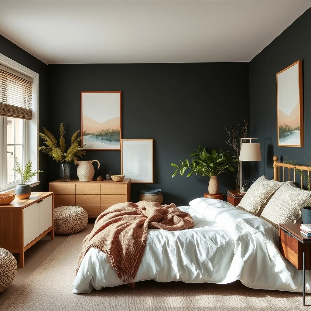
Charcoal offers a dramatic, yet cozy, backdrop that absorbs winter’s low light and creates a cocooning effect. Introducing blush accents—through pillows, a rug, or a painted accent chair—softens the darkness and adds a gentle pop of color without breaking the calm. The charcoal walls act like a canvas, allowing the blush to stand out as a subtle highlight. To keep the room from feeling overly somber, incorporate metallic finishes such as brushed gold lamp bases or a mirror with a warm frame; these reflect light and introduce a hint of sparkle that feels festive rather than garish. This scheme works well in larger bedrooms where the charcoal can be balanced by ample floor space; in a compact room, limit charcoal to a single accent wall to avoid a cramped feeling.
5. Choose Dusty Lavender with Natural Textiles
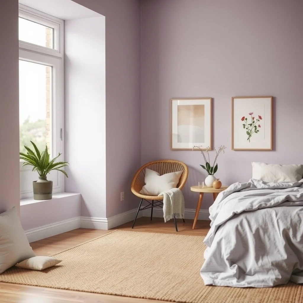
Dusty lavender, a muted purple with gray undertones, brings a quiet elegance that feels soothing during the colder months. Pairing this hue with natural textiles—think a woven jute rug, a linen duvet, and a rattan headboard—creates a layered look that feels both refined and relaxed. Lavender on the walls reflects the soft, diffused winter light, while the natural textures introduce an earthy counterpoint that grounds the space. Because lavender can appear cool if overused, balance it with warm lighting: a table lamp with a amber shade or a string of low‑voltage bulbs along a headboard adds a gentle glow that enhances the color’s cozy qualities. This palette may feel too pastel for those who prefer deeper hues, so consider deepening the lavender with a slightly richer shade on the ceiling or a decorative wall panel.
6. Incorporate Warm Taupe with Layered Textures
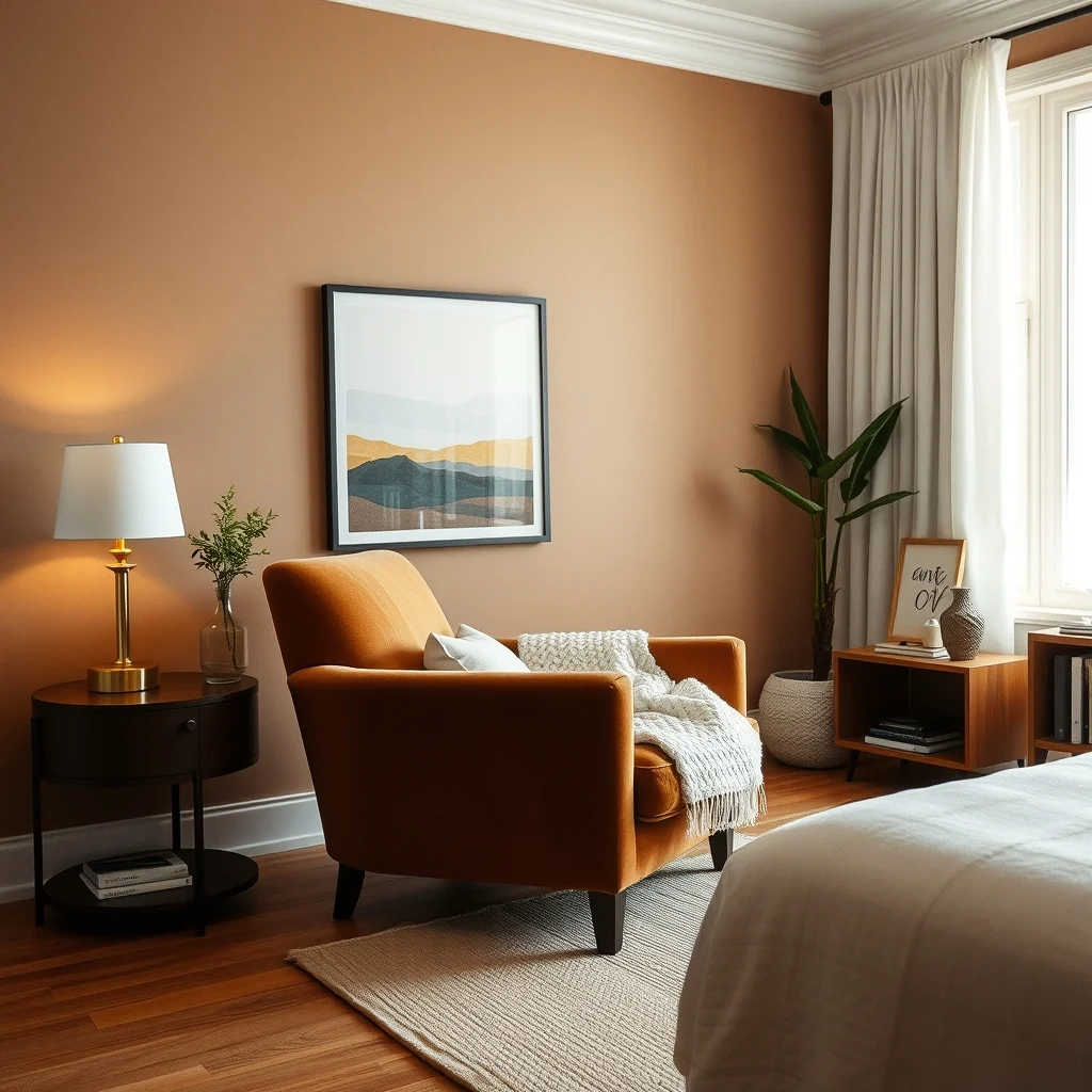
Warm taupe is a timeless shade that reads as both neutral and inviting, especially when layered with varied textures. Paint the walls in taupe and introduce a plush velvet armchair, a chunky knit blanket, and a sisal area rug. Each material contributes a different tactile experience, encouraging you to linger longer in the room. The warmth of taupe works well with dark walnut or cherry furniture, as the deeper wood tones echo the color’s subtle brown undertones. For a practical touch, select washable fabrics for the bedding and throws; winter months often bring spills from hot cocoa or tea, and easy‑care textiles keep the room looking fresh without sacrificing comfort. If the bedroom receives limited natural light, add a floor lamp with a wide shade to diffuse light evenly across the textured surfaces.
7. Blend Soft Sage with Light Gray Accents
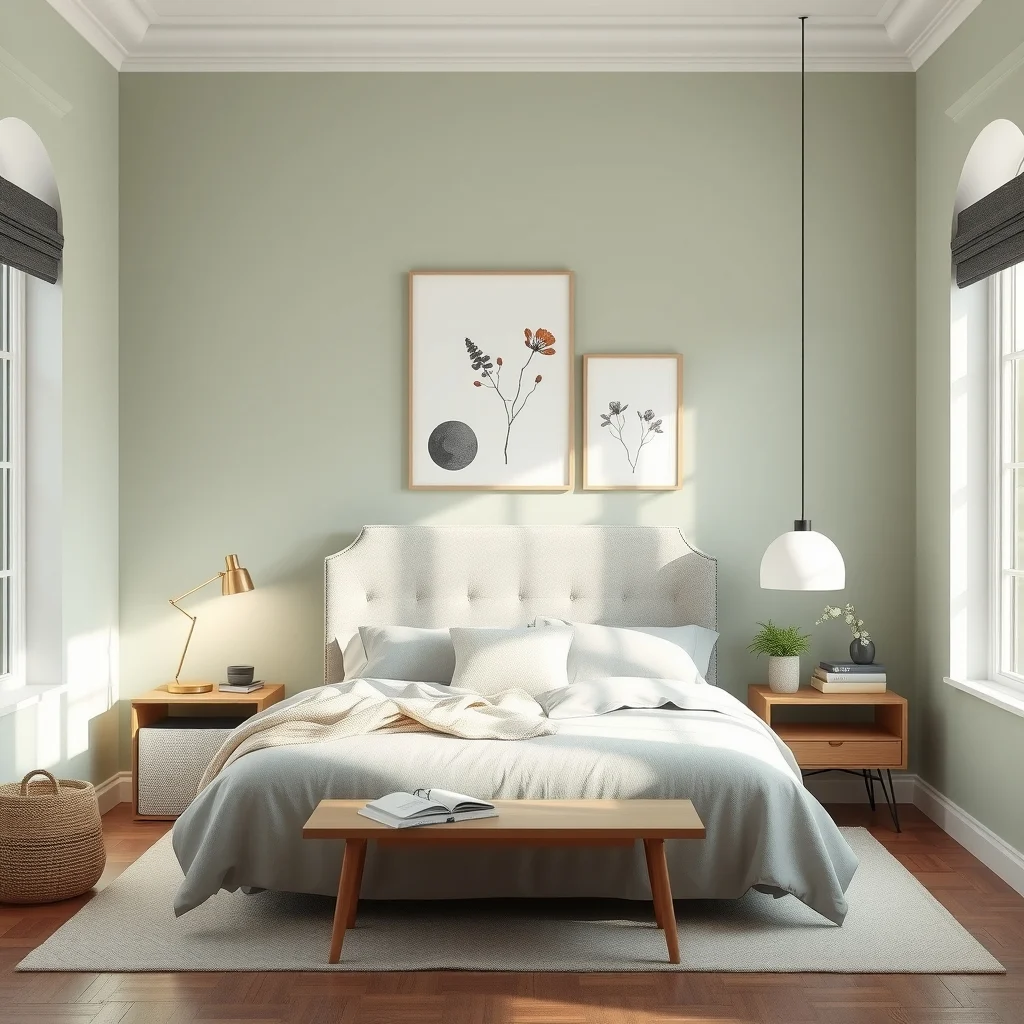
Soft sage offers a muted green that feels restorative, reminiscent of evergreen foliage seen through a frosted window. Pair this with light gray accents—such as a gray upholstered headboard or a set of slate‑colored bedside tables—to create a harmonious duet that feels balanced and tranquil. The gray provides a subtle contrast that prevents the sage from feeling too monochromatic, while still maintaining a low‑key palette appropriate for a winter retreat. To enhance the soothing effect, incorporate a few potted herbs or a small fern; the living greenery adds a breath of freshness without breaking the color harmony. This combination works best in rooms where the ceiling height is generous; in lower ceilings, keep the sage on the walls and limit gray to smaller pieces to avoid a visual compression.
FAQ
How can I make a dark color scheme feel larger?
Use lighter bedding, reflective accessories, and ample lighting to counterbalance the depth of dark walls. A large mirror opposite a window also bounces light, creating the illusion of more space.
Is it okay to mix warm and cool tones in a winter bedroom?
Yes, mixing warm and cool tones can add visual interest while still feeling cozy. Pair a warm wall color with cool textiles, or vice versa, and let neutral elements bridge the gap.
What type of lighting works best with these color schemes?
Layered lighting—combining overhead fixtures with bedside lamps and soft floor lamps—provides flexibility. Warm‑toned bulbs (around 2700 K) enhance the snug atmosphere without overwhelming the palette.
Can I use these ideas in a small bedroom?
Absolutely, but prioritize lighter shades on larger surfaces and reserve deeper hues for accent walls or accessories. Keeping furniture streamlined helps maintain an open feel.
How do I keep the colors looking fresh over time?
Choose washable fabrics for bedding and curtains, and opt for paint finishes that resist scuffs. Regular dusting of wood and metal pieces preserves the warmth of the finishes.
Final Thoughts
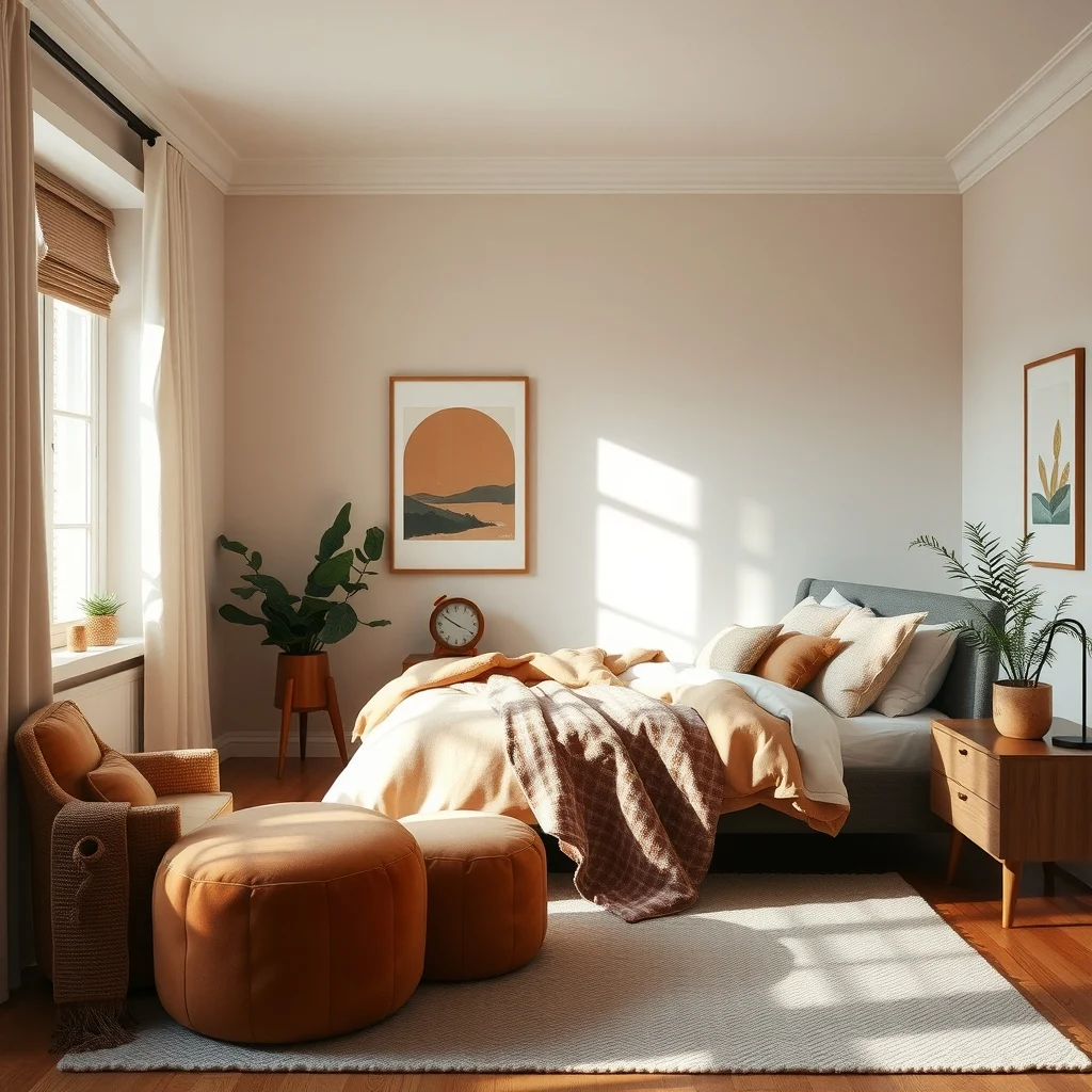
Choosing a winter bedroom palette is less about following trends and more about creating a sanctuary that embraces the season’s quiet energy. Whether you gravitate toward earthy terracotta, soothing sage, or the understated elegance of greige, the right combination of hue, texture, and light can transform your sleeping space into a place you genuinely look forward to entering each night. Take the ideas that resonate most, adapt them to the specifics of your room, and let the subtle warmth of color guide you through the colder months.